
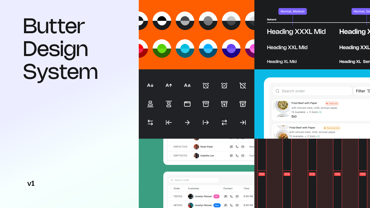
Butter Design System
Building the design infrastructure behind a multi-module restaurant management platform
Role
Product Designer
Scope
Design tokens, components, patterns, documentation, and system architecture
Platform
Web
Focus
Scalable UI, consistency, and reusable product patterns
Butter is a restaurant management product covering operations, staff, inventory, finance, and other day-to-day workflows. Because the product was being designed from the ground up, it needed a consistent foundation that could support different workflows without making each part of the product feel disconnected.
I worked on the design system from its foundations through to the component library and documentation, creating a shared visual language that could support the product as it grew.
What I did
- Defined the visual foundation across color, typography, spacing, sizing, grids, breakpoints, elevation, radius, and motion.
- Built the token architecture with 13+ collections and 400+ variables.
- Designed the reusable component library with consistent variants, states, and responsive behavior.
- Built the component library in Storybook with React and TypeScript and documented how the system should be used.
- Established naming and structure rules to keep the system consistent as new product areas were added.
The Problem
1.1Context
The product was being designed from the ground up as a restaurant management platform covering several different workflows, including:
- Restaurant operations such as orders, tables, and kitchen activity
- Financial operations including revenue, transactions, and payouts
- People and workforce management including schedules, performance, tips, and attendance
- Inventory and vendors including stock, suppliers, and reordering
- Hardware and connected devices used throughout restaurant operations
The challenge was creating one visual foundation that could support all of these areas without each part of the product feeling like a separate application. The system needed to be flexible enough for different workflows while still feeling consistent and familiar.
1.2Early exploration
Since the product was being designed from scratch, my early work focused on understanding the product space and the workflows the system would need to support.
- Product exploration to understand the main workflows and information needs across restaurant operations.
- Competitive review of restaurant and operations products to understand common patterns for navigation, dense data, dashboards, and responsive layouts.
- Workflow mapping to identify the information different users would need most often and where visual hierarchy mattered most.
- Interface exploration to establish a visual direction that could work across the different areas of the product.
1.3Design priorities
Fast scanning
Operational users needed to understand status and important information quickly, especially during busy periods.
Clear hierarchy
Dashboards and operational screens needed to present a lot of information without making everything compete for attention.
Consistency
Different product areas needed to share the same visual language instead of developing their own patterns.
Scalability
The foundation needed to support new modules without rebuilding the same interface patterns each time.
Why Atomic Design
Brad Frost's Atomic Design methodology (Tokens → Atoms → Molecules → Organisms → Templates → Pages) was the natural fit for three reasons specific to this product:
1. Reusability across radically different modules
An "Icon + Label + Switch" molecule used to toggle a WiFi device in Inventory is structurally identical to the one used to toggle Dark Mode in Settings. Atomic thinking makes that reuse explicit instead of accidental.
2. Traceable governance
When a designer or engineer asks "can I change this button's radius," atomic layering gives a definitive answer: no, that's a token, change it once, and every button, tab, and badge in the system inherits it.
3. Clearer design handoff
The system created a shared visual foundation for the product, making it easier to communicate design decisions and hand off consistent, well-defined screens to the development team.
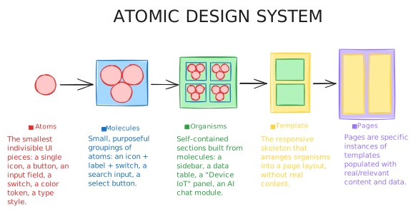
Foundations: The Token Layer
Every visual decision in Butter starts as a token, not a hardcoded value. I structured tokens in Figma Variables across dedicated collections so that design and engineering share a single naming contract.
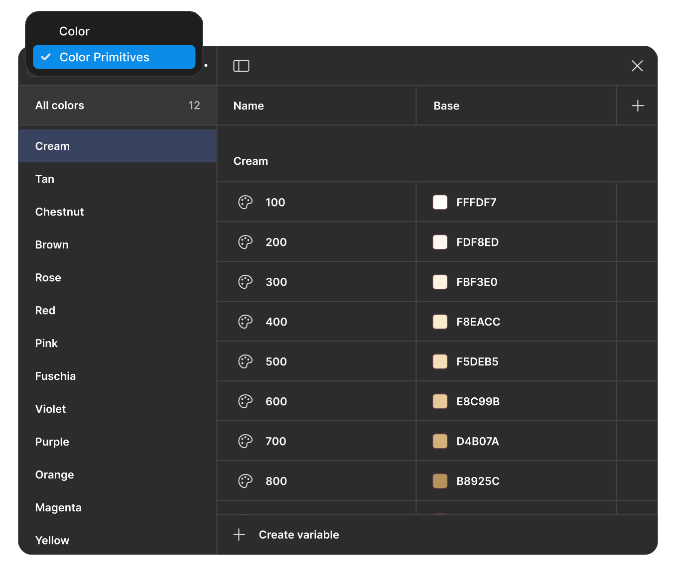
Color Primitives. Cream 100–1400
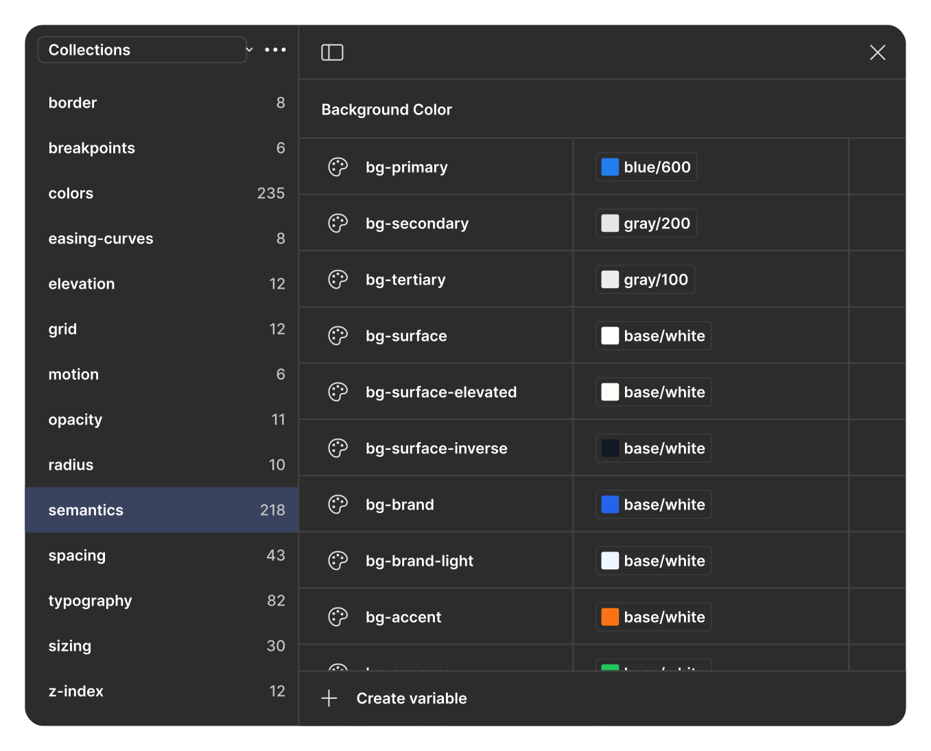
Semantic tokens. Background color, etc
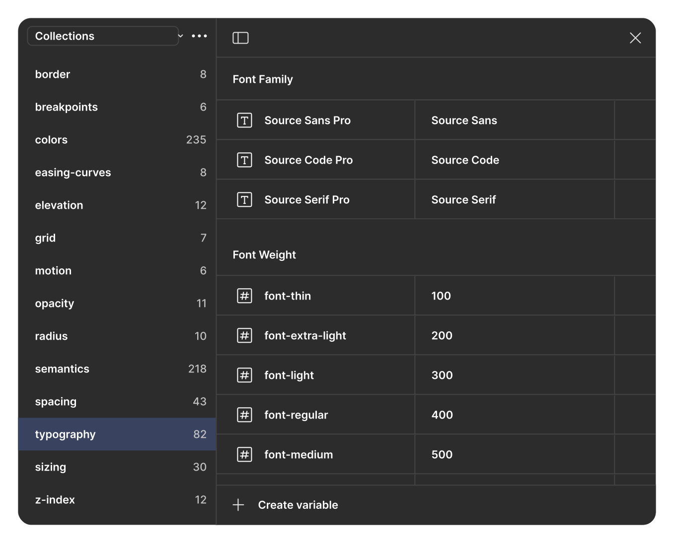
Type tokens
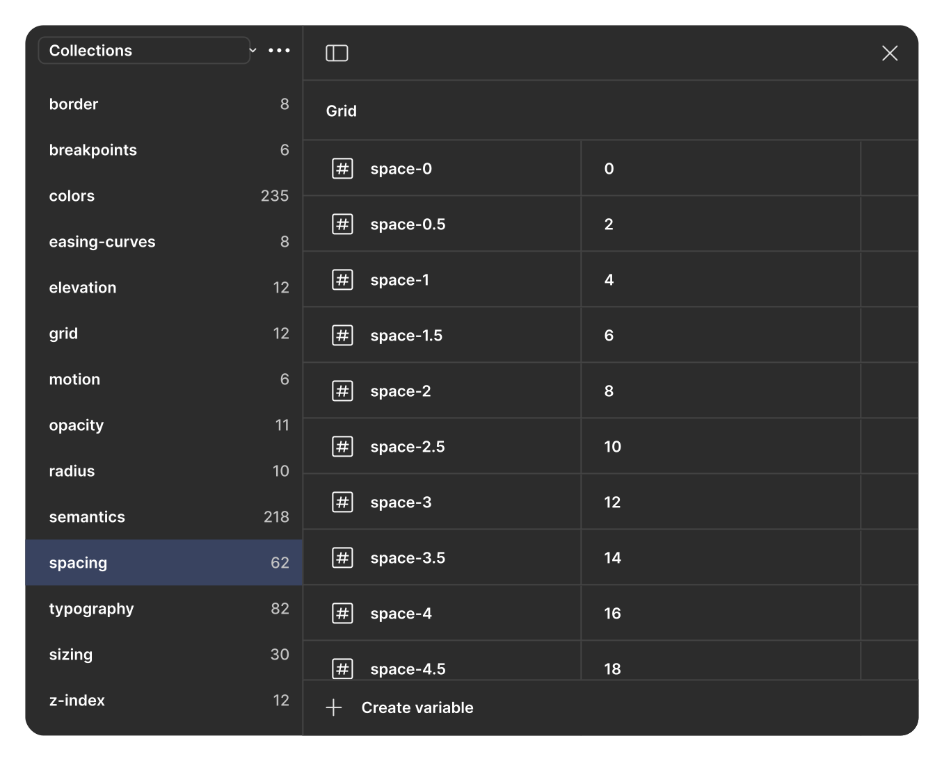
Spacing scale
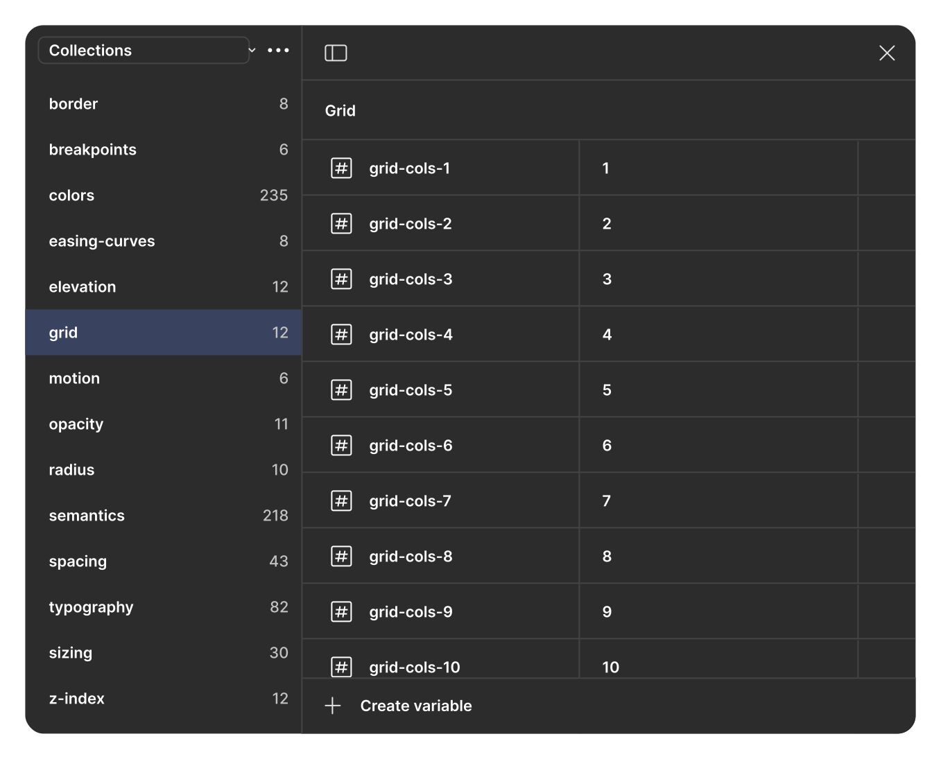
Grid tokens. 1 to 10 column configurations
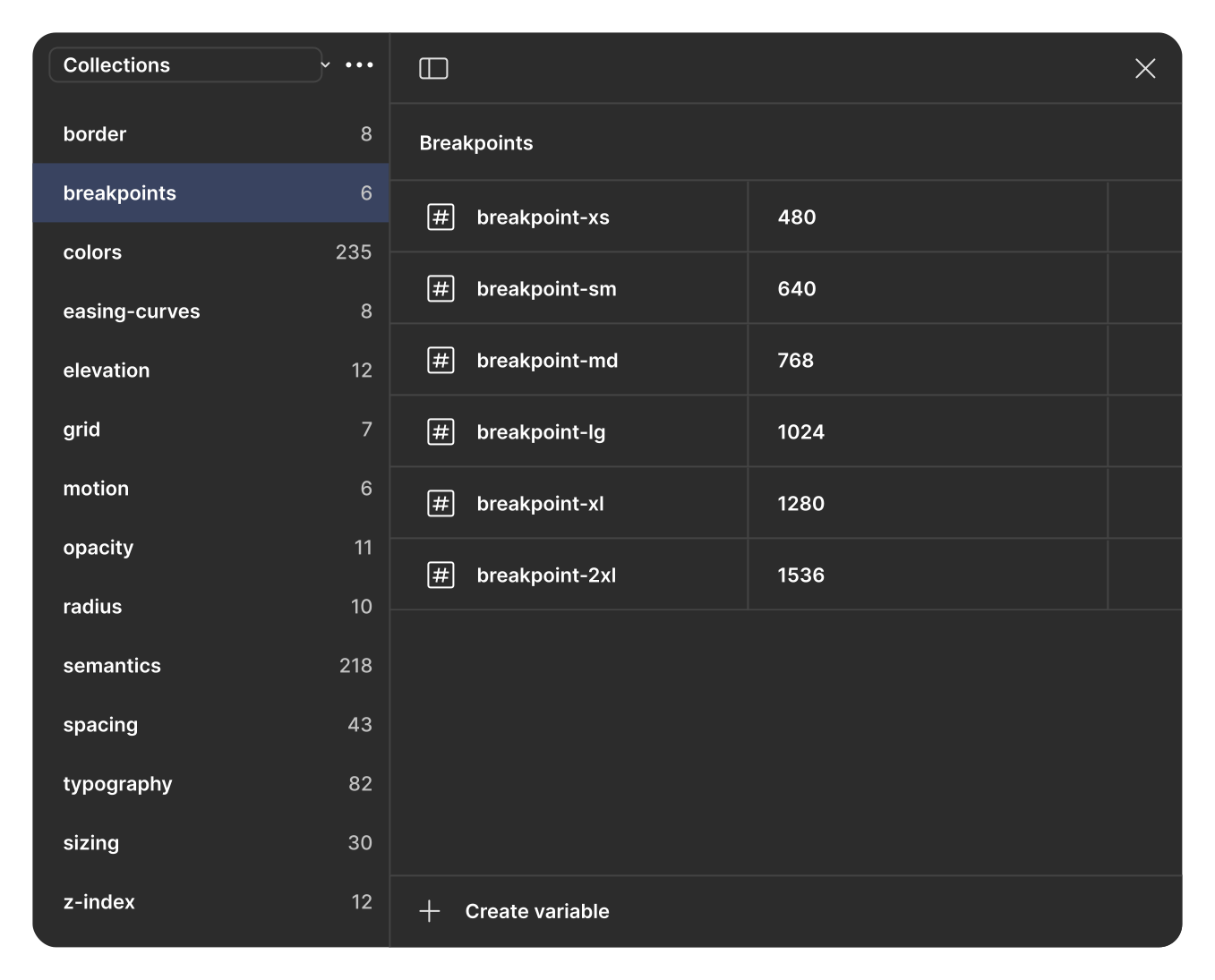
Breakpoint tokens — xs (480) through 2xl (1536)
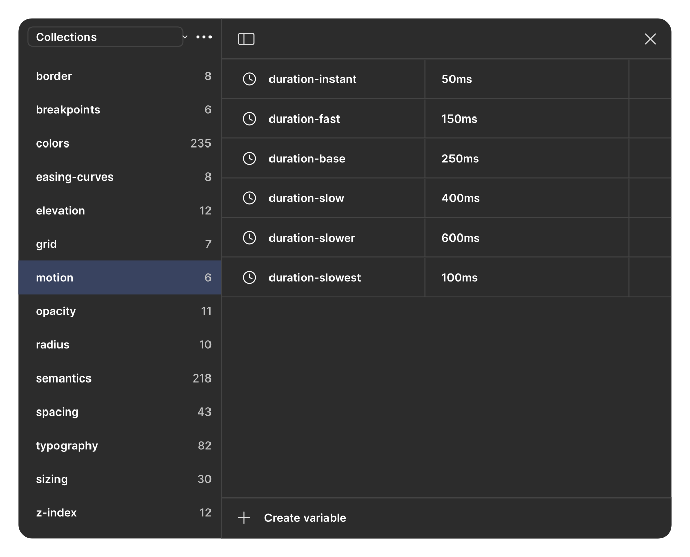
Motion tokens
Atoms
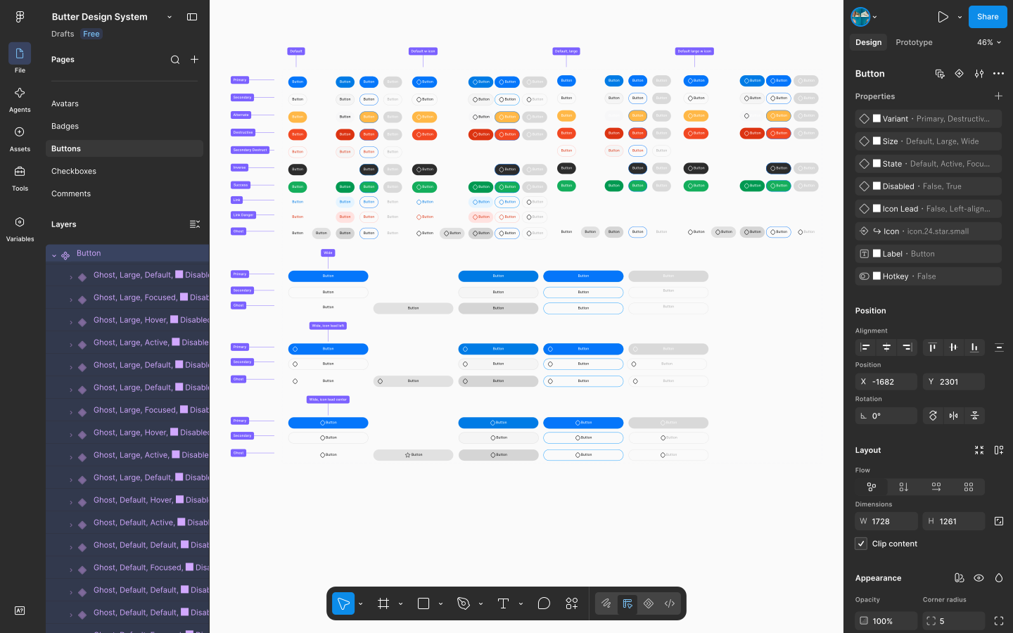
I started with the smallest reusable elements: buttons, inputs, switches, icons, and other basic controls. Each component was built as a single Figma component with variants and states, so the same building blocks could scale across different product workflows.
Buttons
Buttons were defined around a consistent set of variants, sizes, and interaction states. This kept the component flexible without creating separate versions for every use case.
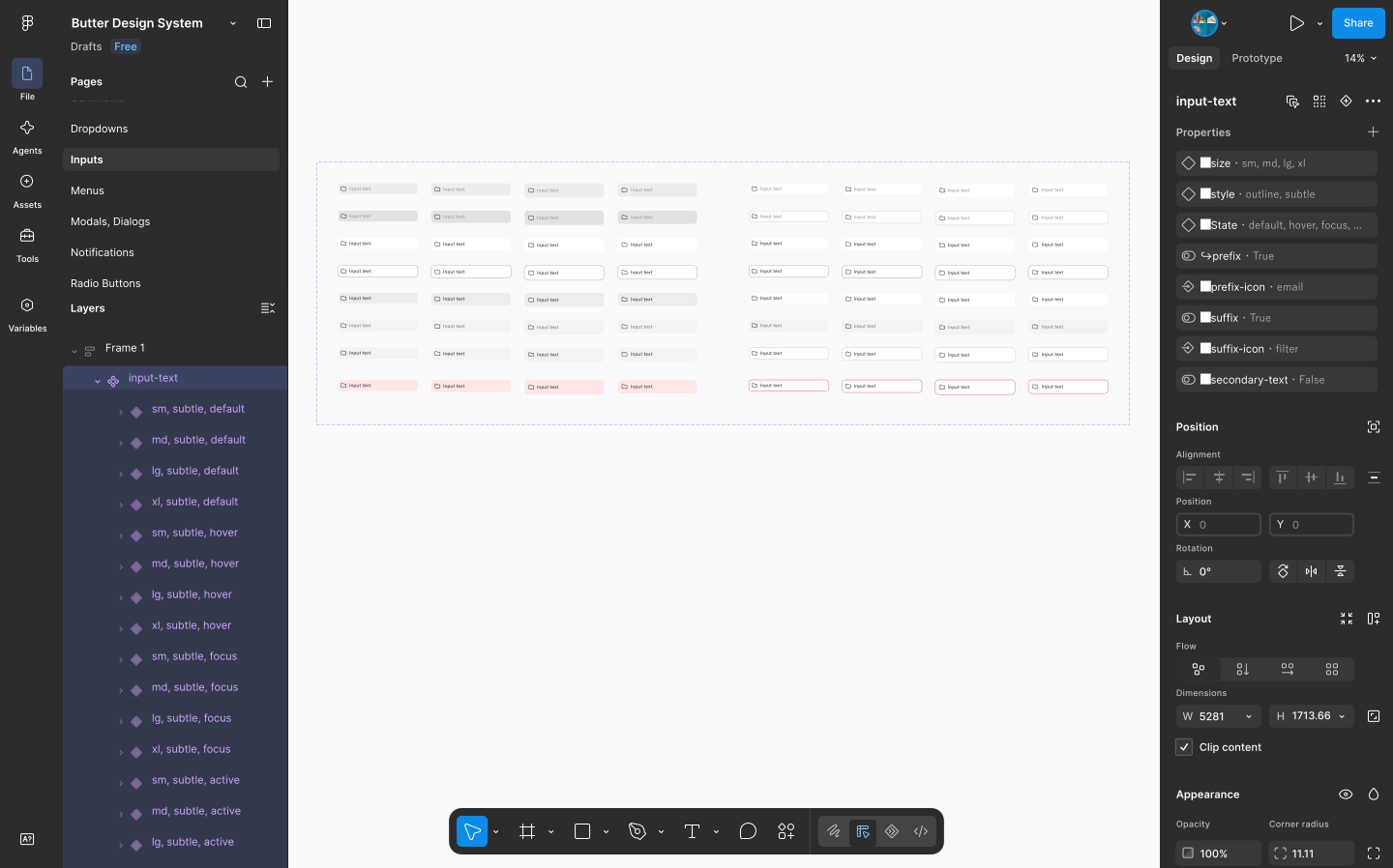
Form controls
Inputs and other form controls were designed with their states in mind from the start. Size, style, focus, error, and supporting content could be changed without creating separate components.
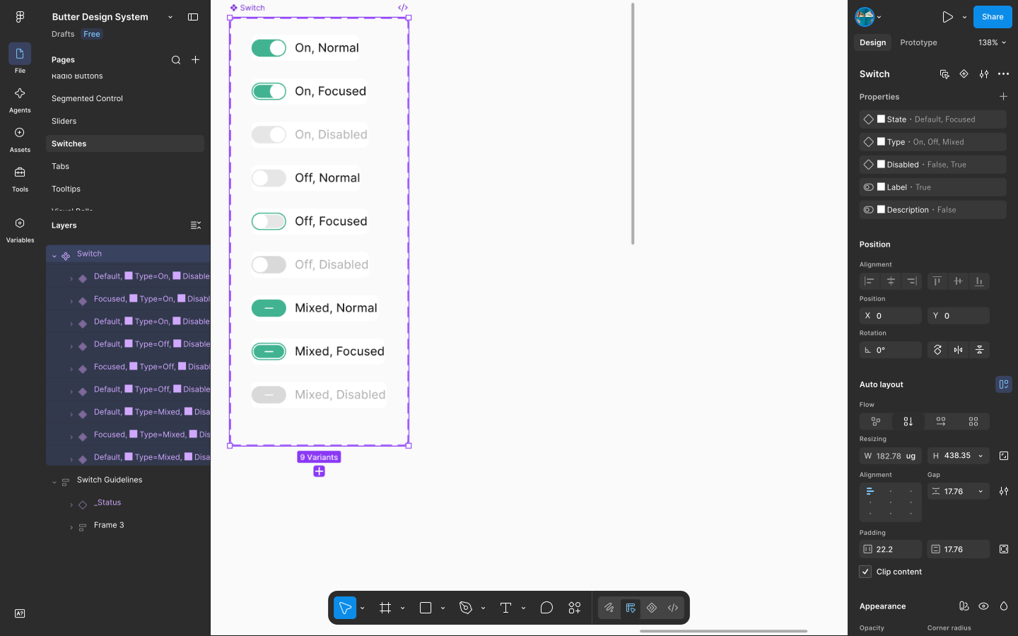
Other foundations
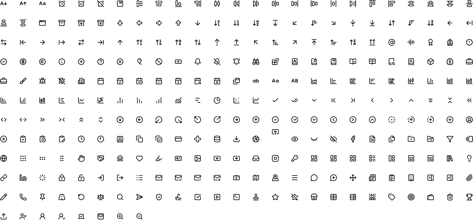
The same approach was applied to switches and icons. Switches covered their key interaction states, while a consistent 24px icon grid and stroke weight kept the interface visually cohesive.
Molecules
Molecules are where atoms start doing a job. To make this layer teachable to the rest of the team, I dissected real molecules and annotated exactly which atoms compose them.
Anatomy: the AI Assistant input
This molecule combines an invisible input (an Input atom with no visible chrome), a Tab atom pair, an illustrative icon, a rounded icon button, and a select button into a single reusable "ask anything" search/chat molecule used across the product wherever a user needs quick, natural-language access to data.
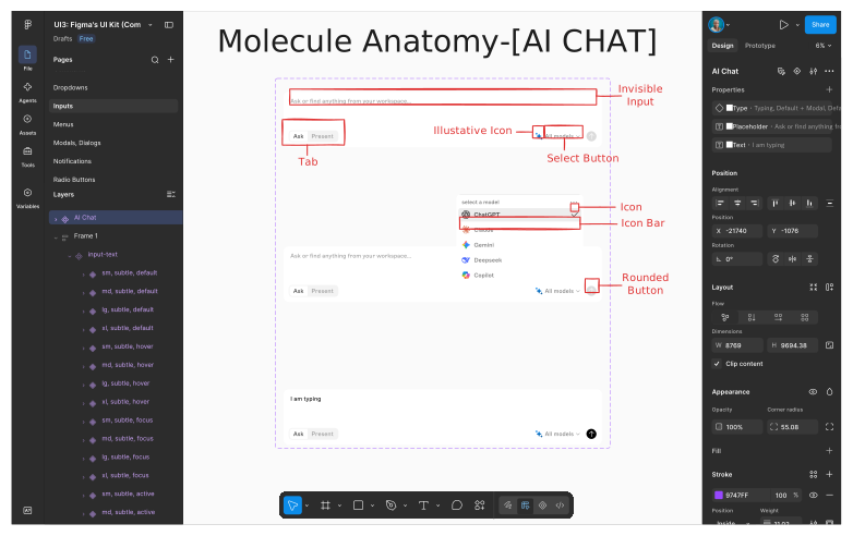
Molecule Anatomy of AI Chat Input
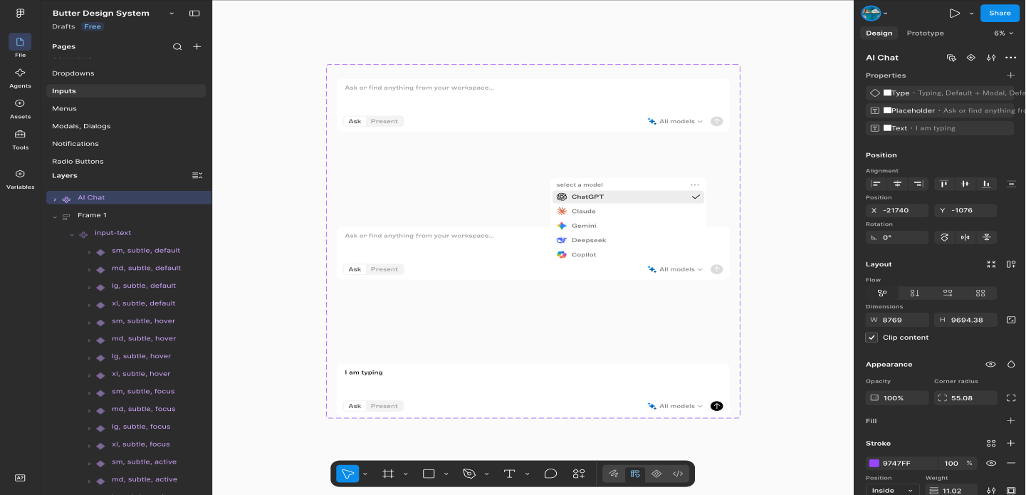
The AI Chat molecule shown across with its Type variants as one governed component
Organisms
Organisms are where Butter had to prove it could hold up dense, with real operational data not just marketing page UI.
The Sidebar
The primary navigation is a fully dissected organism: a Logo atom, an Icon atom for collapse, a Search Input molecule, a stack of Icon Bar molecules forming the Core Modules Block (Overview, Orders, Products, Inventory, Reservation, Table, Payments, Employee, Customer, Reports & Analytics, Marketing & Campaign, Integration), and a separate User Preferences Block where an Icon Bar + Switch molecule powers Dark Mode.
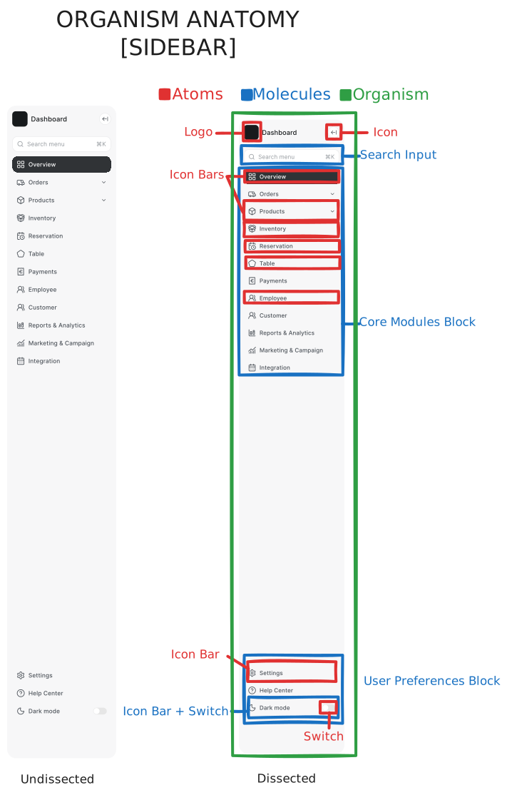
Sidebar organism, undissected vs. dissected placed side-by-side
The Device IoT panel
A second organism example: a "Device IoT" card grid where each Device Item molecule (Icon + Label + Switch, or Icon + Label + Image) repeats inside a bordered organism shell with its own header (Icon + Title) and an Icon Bar for pagination, used to give managers live control over WiFi, lighting, and CCTV hardware from the same dashboard where they read revenue.
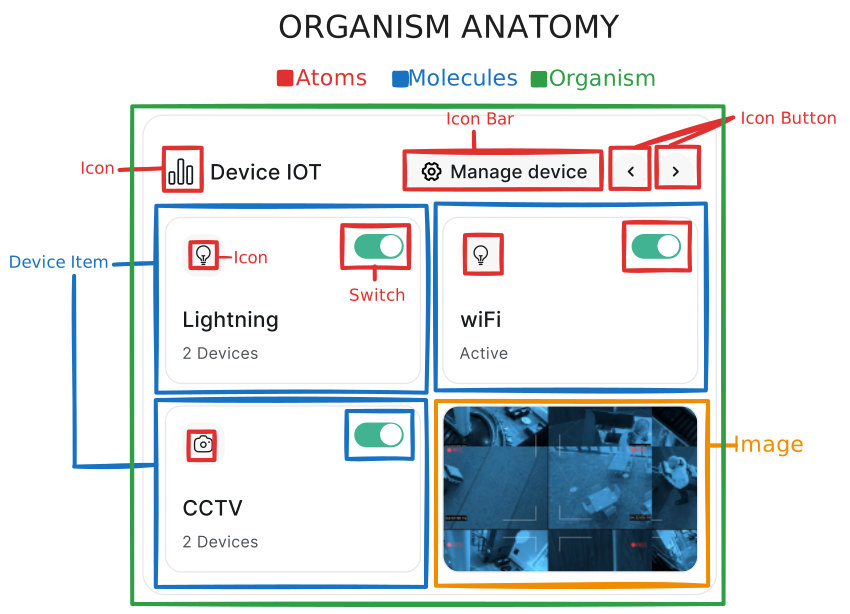
Device IoT organism dissected
Templates
Templates strip organisms of real content and define how the page skeleton behaves across breakpoints, which is the layer that turns "a dashboard" into "a dashboard that survives being opened on a 13" laptop during service."
The Dashboard template resolves to a 2-column layout at both Desktop and Laptop breakpoints (fixed-width sidebar + fluid content, with a secondary right rail), and collapses to a single stacked column at Mobile — preserving section order (summary → revenue → breakdown → staff → devices → reminders) so the priority hierarchy never gets scrambled by screen size.
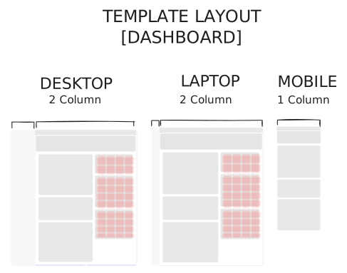
Template Layout - Dashboard skeleton
Pages: Tokens to Production, End to End
This is the layer that proves the system: the same five-color legend (Atoms → Molecules → Organisms → Template → Pages) traced across one real surface - the Overview Dashboard.
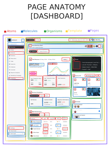
Full Page Anatomy. The Dashboard fully dissected across all five atomic layers
Reading it left to right: the sidebar's individual icons and the header's date/notification atoms compose into the Search and Icon Bar molecules; those molecules compose into the Sidebar and Top Bar organisms; the organisms slot into the 2-column Dashboard template; and the template which is filled with live revenue, staff, and device data, becomes the page a restaurant owner opens every morning.
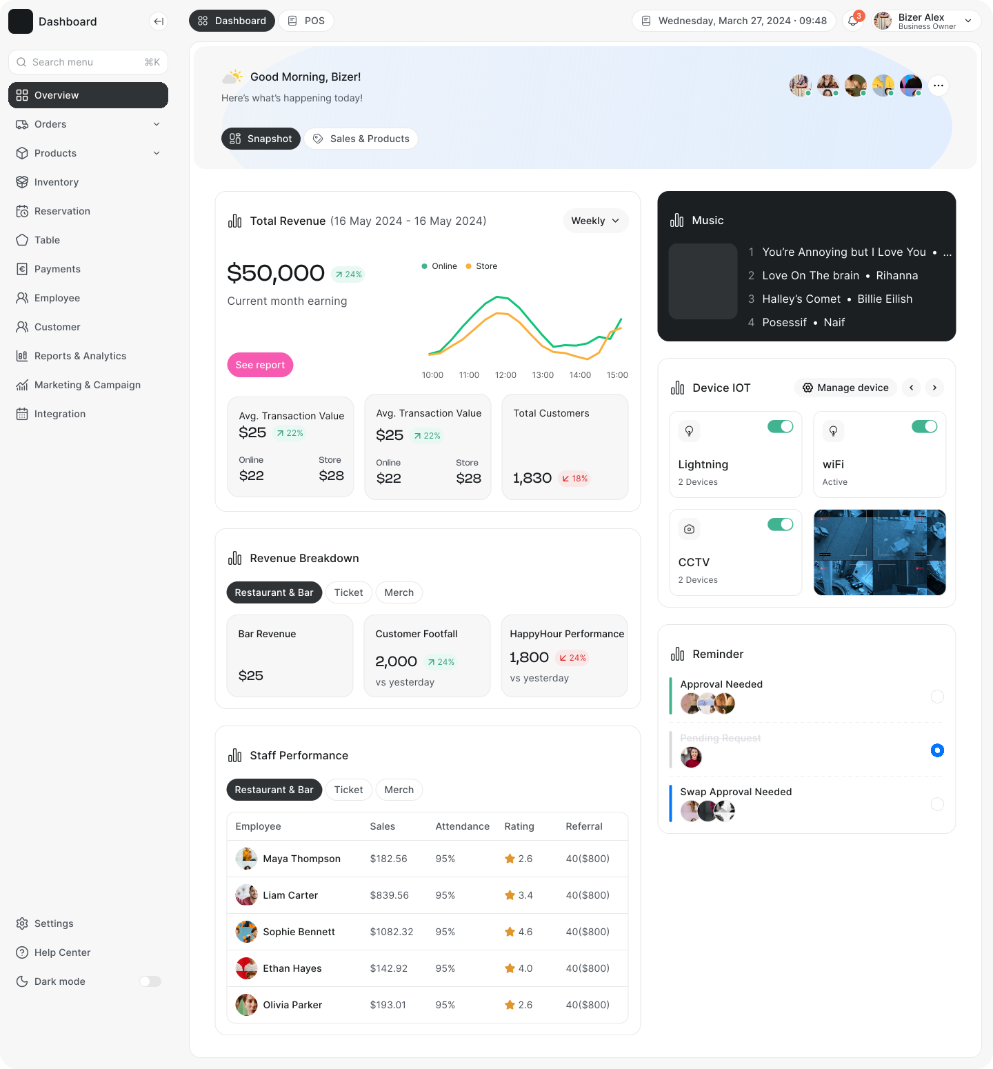
Final production Dashboard
From wireframe to system
Before any visual layer was applied, I blocked the same page as a low-fidelity wireframe to validate content hierarchy and grid proportions independent of color or type, confirming the 2-column revenue/staff split and the right-rail device/reminder stack held up before a single token was applied.
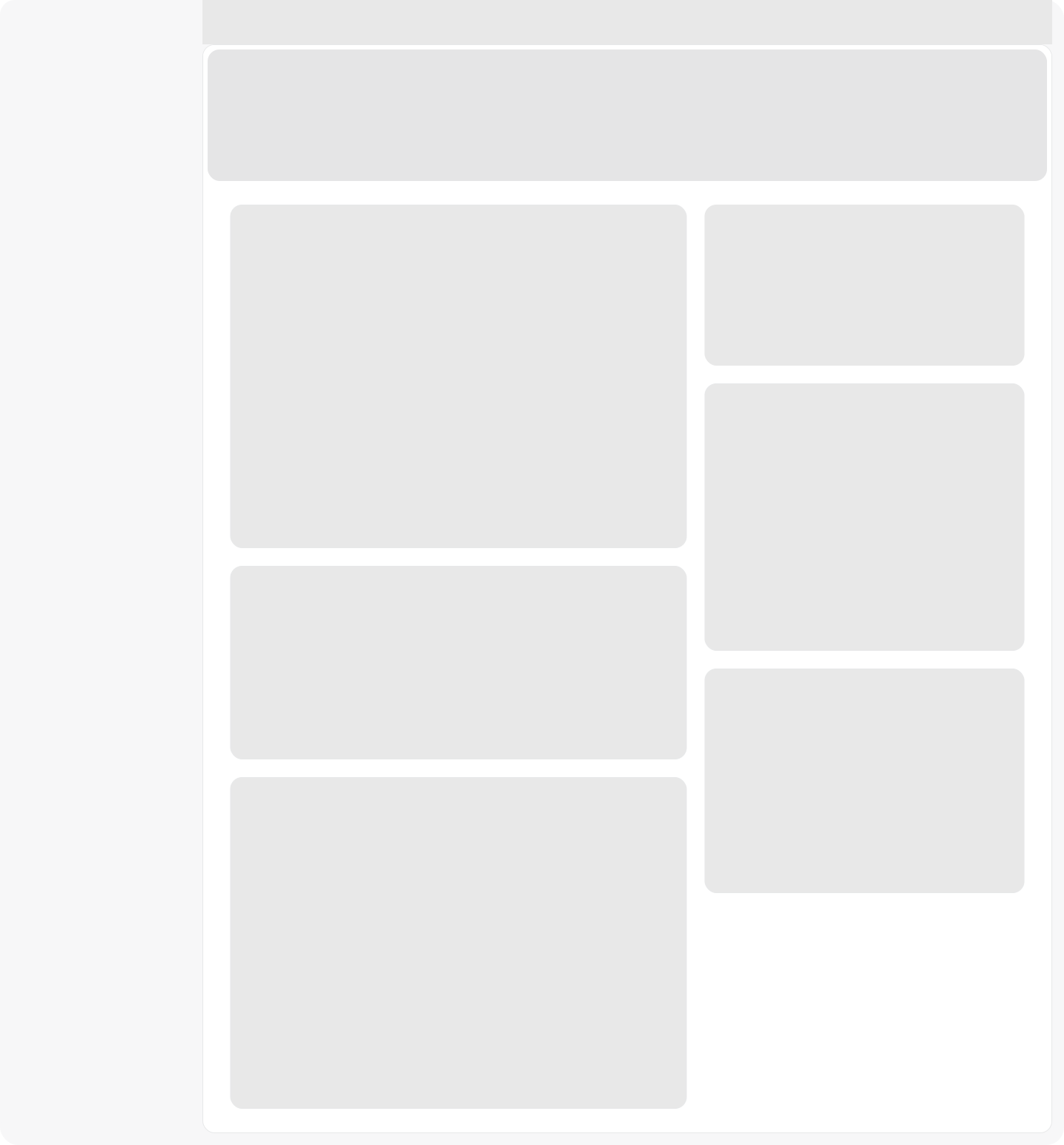
Low-fidelity wireframe of the Dashboard with grid and hierarchy only
The system in motion
Beyond static screens, Butter's organisms had to hold up under real interaction, thus status changes, inline edits, dropdown selection all inside a live data table. The clip below shows the Table organism (built from badge, avatar, dropdown, and button molecules) handling an order-status update and a "Place New Order" flow without breaking its row rhythm or auto-layout constraints.
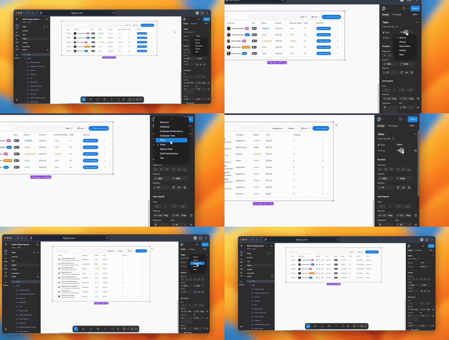
Order table organism
Governance & Handoff
I wanted the system to work beyond Figma. Since I also worked with React and TypeScript, I built the component library in Storybook so the same patterns could be reviewed as real, working components rather than only as static designs.
From Figma to Storybook
The goal was to reduce the amount of interpretation needed during handoff. Component properties in Figma were matched to the props used in Storybook, giving both sides a shared vocabulary for variants, sizes, states, and tokens.
- Figma defined the component structure. Variants, states, sizes, and token usage were documented as part of each component.
- Storybook brought those patterns into code. Components could be viewed, tested, and adjusted using their real props.
- Both used the same naming and structure. This made it easier to move from a design decision to an implementation.
Storybook documentation
I organized Storybook around the same component structure used in Figma. It included guidelines for things like color and iconography, along with interactive documentation for the component library.
Each component could be explored through its different variants and states, with controls for changing props and a code view for seeing how the component was implemented.
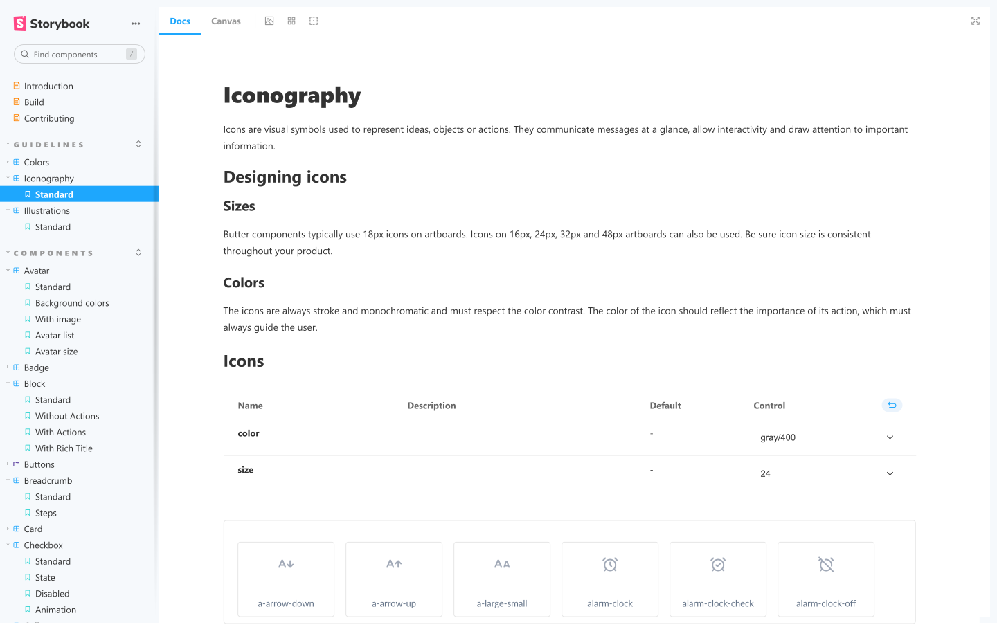
Storybook documentation and interactive controls
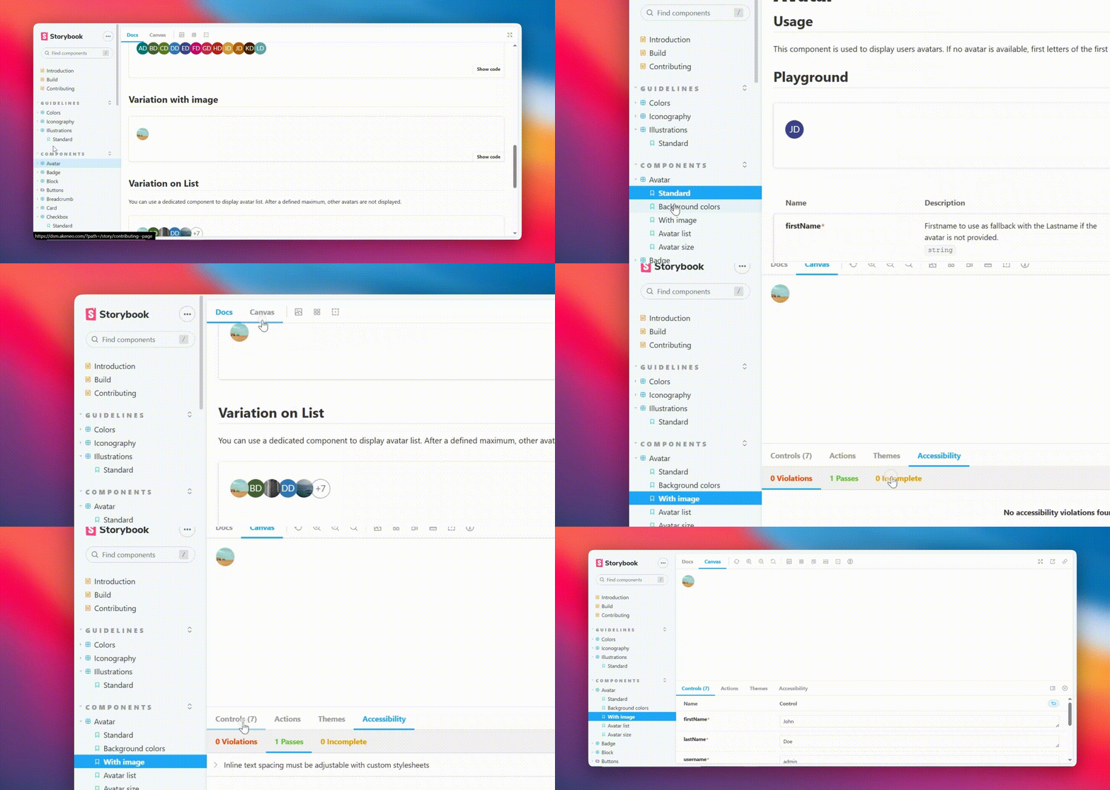
Short walkthrough of the Storybook library
Governance principles
I kept the system consistent with a few simple rules:
- Use component properties as the shared API. The names used in Figma were kept consistent with the props used in Storybook.
- Use tokens instead of one-off values. Spacing, sizing, colors, and other visual decisions were tied back to the token system.
- Keep the structure consistent. Components followed the same atomic hierarchy in both Figma and Storybook.
- Only introduce new patterns when needed. New components were added when an existing pattern could not reasonably support the product requirement.
What this improved
- Clearer handoff. Designers and engineers could refer to the same component names, variants, and states.
- Better design QA. Components could be checked in the browser across their different states instead of relying only on Figma.
- A living reference. Storybook gave the team a place to explore the components and understand how they were intended to work.
Outcomes
The result was a design system that gave the product a more consistent foundation and made it easier to design and build new modules without starting from scratch.
Shared language
Figma components and Storybook components followed the same structure, properties, and naming.
Consistent UI
Shared tokens and components kept patterns consistent across different parts of the product.
Reusable foundation
New screens could build on existing components and templates instead of solving common UI patterns again.
Living reference
Storybook gave the team a place to explore components, their states, and their implementation as the product continued to grow.
Reflection
What worked
The hardest part was knowing when not to create another component. I kept coming back to a simple question: is this a new primitive, or the same primitive with different tokens? Most of the time, it was the latter. Working across both Figma and Storybook also helped keep that thinking consistent from design through implementation.
What I'd do differently
I would establish the semantic token layer earlier, before building the first components. That would have reduced some of the migration work later as shared status patterns became clearer.
Thanks for reading.
This project is protected by an NDA, so the original design files and full product screens cannot be shared publicly. This case study gives an overview of the system, the decisions behind it, and how I approached the work.