
Stidibudi — Turning Notes Into Quizzes
Product design, front-end engineering, and AI integration for an EdTech quiz generator
Visitors
1.8K+
unique visitors / 7 days
Sessions
2.3K+
sessions / 7 days
Paid
12+
paying users
Quizzes
2K+
generated monthly
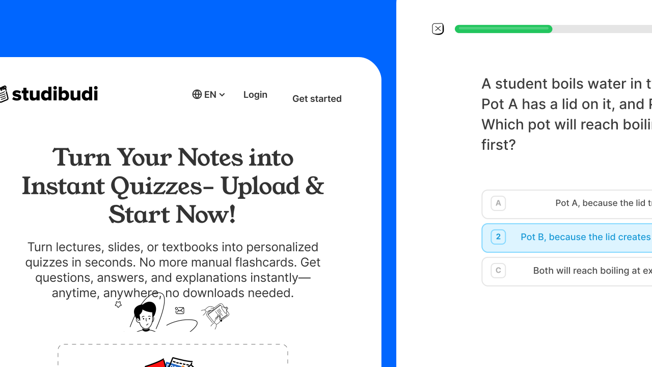
Stidibudi turns a student's own study material — a PDF, a Word doc, a slide deck — into an instant, structured quiz built from their notes, not a generic question bank. I designed it end-to-end (research → wireframes → UI kit → responsive, accessible screens) and built it as a production-grade Next.js app with a multi-model AI pipeline, a subscription paywall, and a component architecture meant to survive real users.
This case study covers both halves: the design decisions behind the experience, and the engineering behind the codebase — including how I actually used AI tooling (Cursor, plus OpenRouter in production) rather than just namedropping it.
The Problem
Studying from your own notes beats studying from someone else's flashcard deck, but turning notes into a self-test is tedious. Students either skip active recall and re-read passively (easy, but the least effective method), or manually retype their notes into a quiz tool, which takes almost as long as writing a full study guide.
A general AI chatbot can technically do this, but the workflow is clunky — paste text, ask for questions, copy the output somewhere, track your score, ask again for an explanation. There's no dedicated surface for "upload → play → learn from mistakes → repeat."
Design Process
2.1Mapping the journey before touching a screen
Before any UI work, I mapped the full user journey so the happy path and its edge cases (wrong answers, an expired free tier, cancelling a subscription) were designed as one connected system, not a pile of disconnected screens.
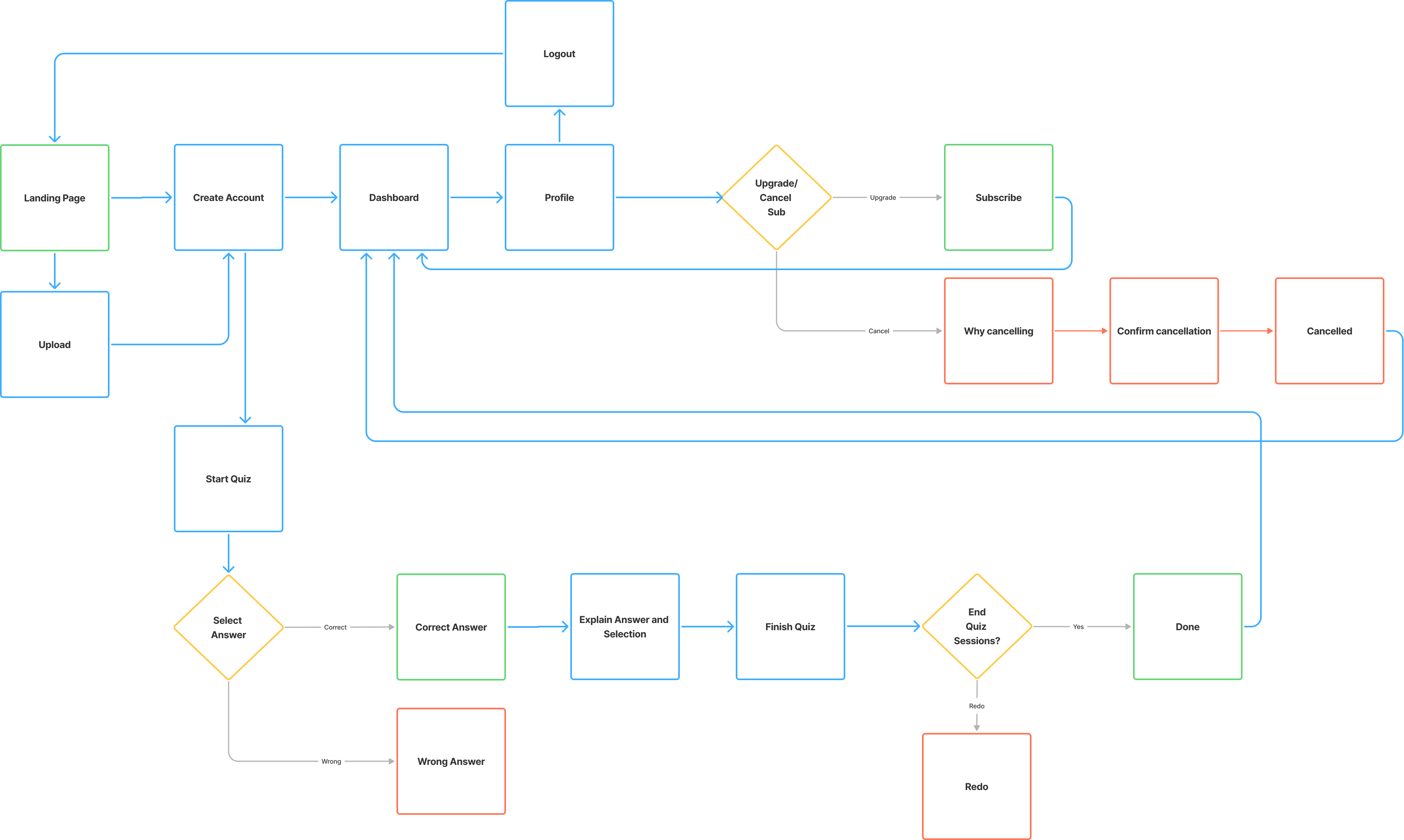
Stidibudi end-to-end user journey map
This surfaced an early call: the free tier needed a natural, non-punitive ceiling. Rather than shrinking quiz length (a worse quiz, a worse first impression), I capped the number of quizzes a free user can generate. Every quiz — free or paid — still feels like the real product, and the upgrade moment ties to one easy-to-explain limit: "2 quizzes free, then unlimited."
2.2Low-fidelity wireframes
I sketch on paper first, deliberately, before opening Figma — it's faster to throw away a bad idea when it costs ten seconds of pen strokes rather than twenty minutes of component nudging, and it keeps me focused on flow before color and type.
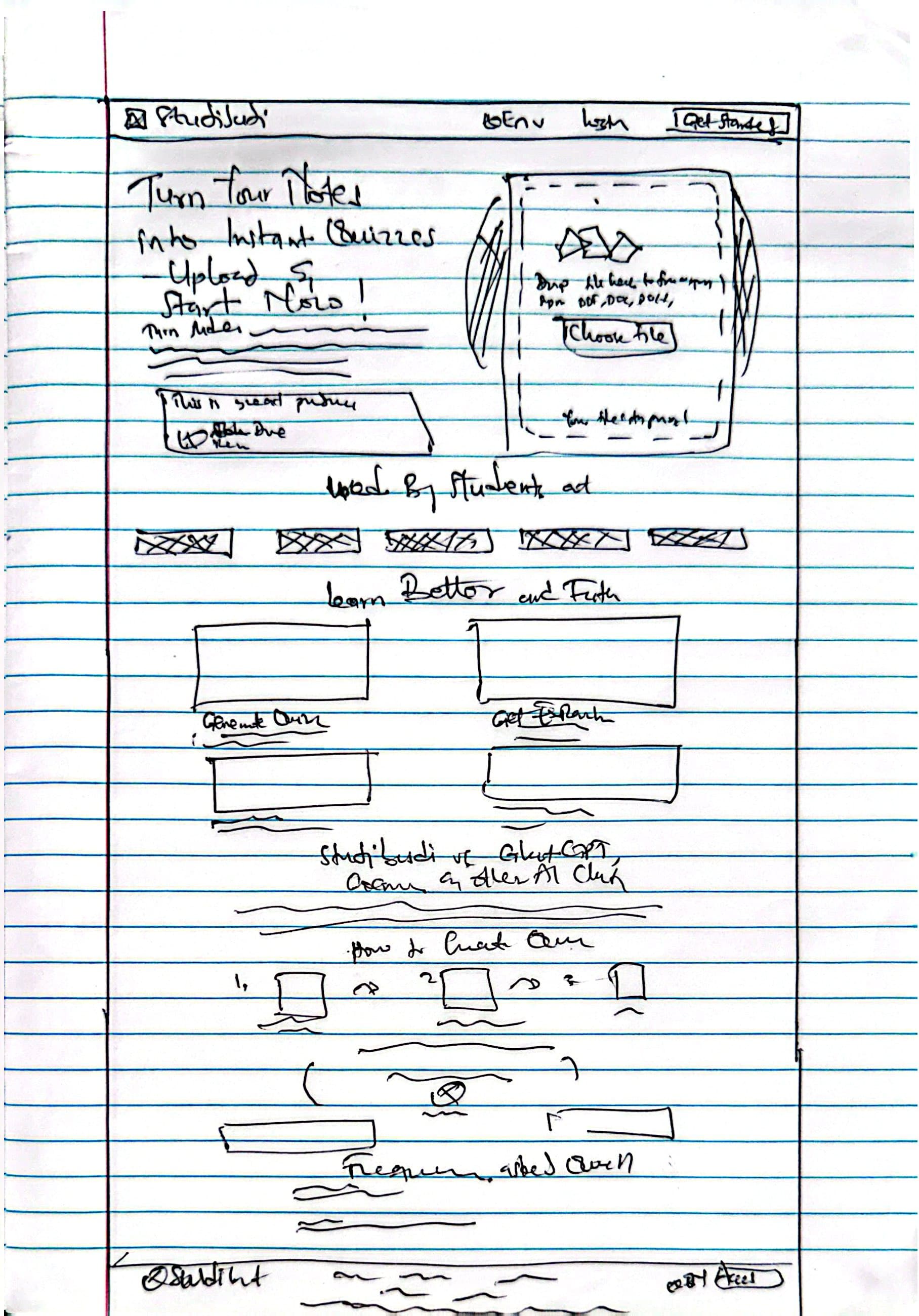
Landing page
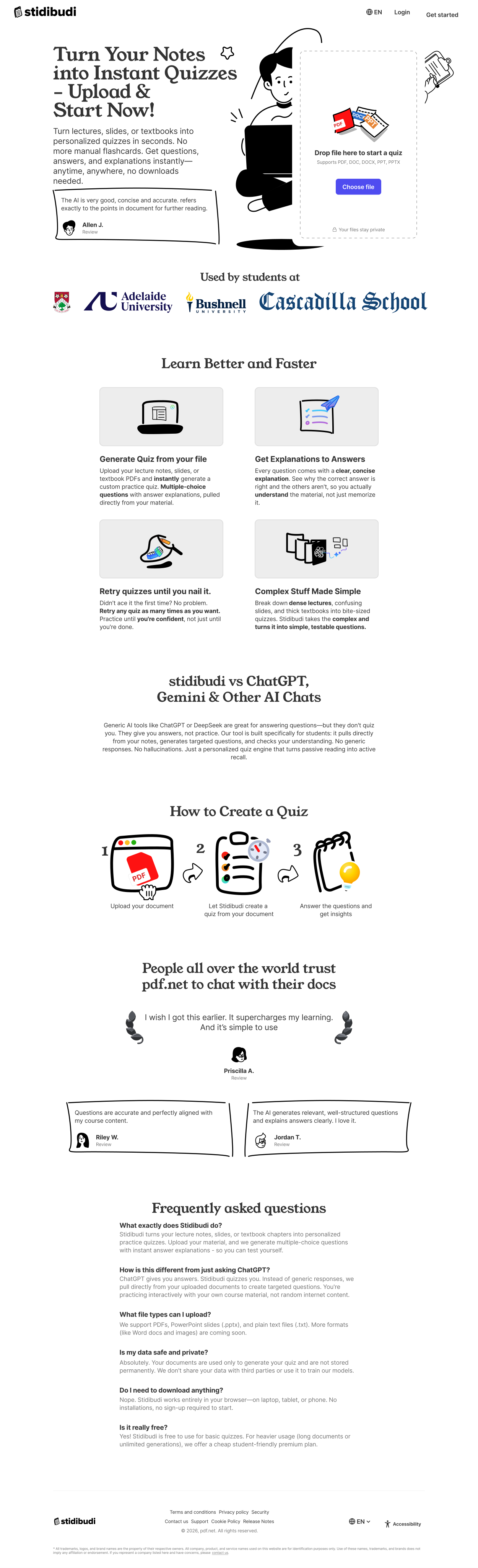
The job of this screen is singular: get a file dropped into the upload zone. Everything else — social proof, comparison against tools like ChatGPT, a "how it works" strip — exists to build enough trust that a first-time visitor hands over a file before they've even created an account.
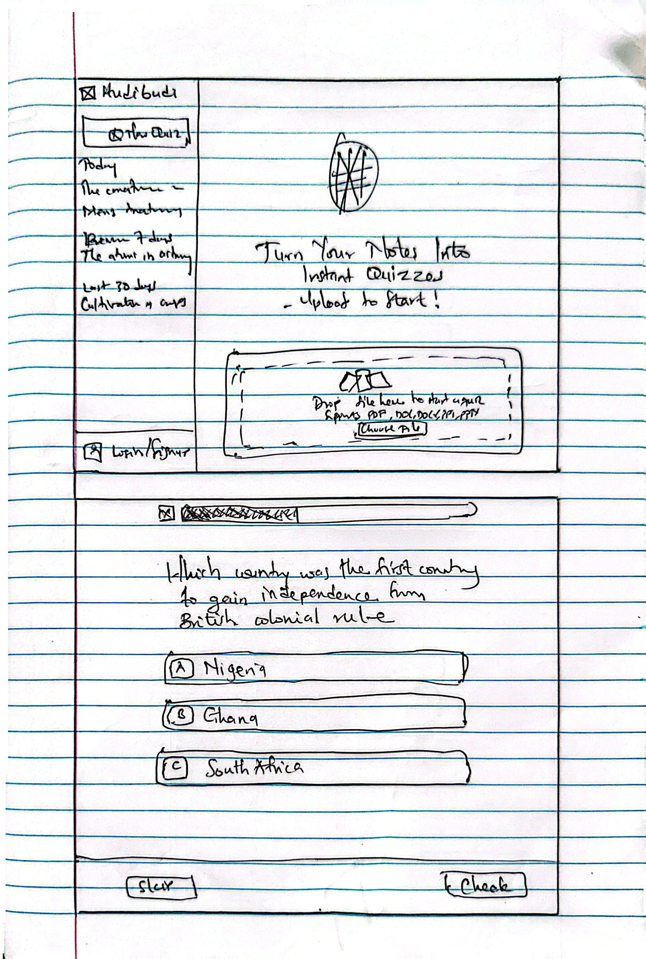
Dashboard and quiz question
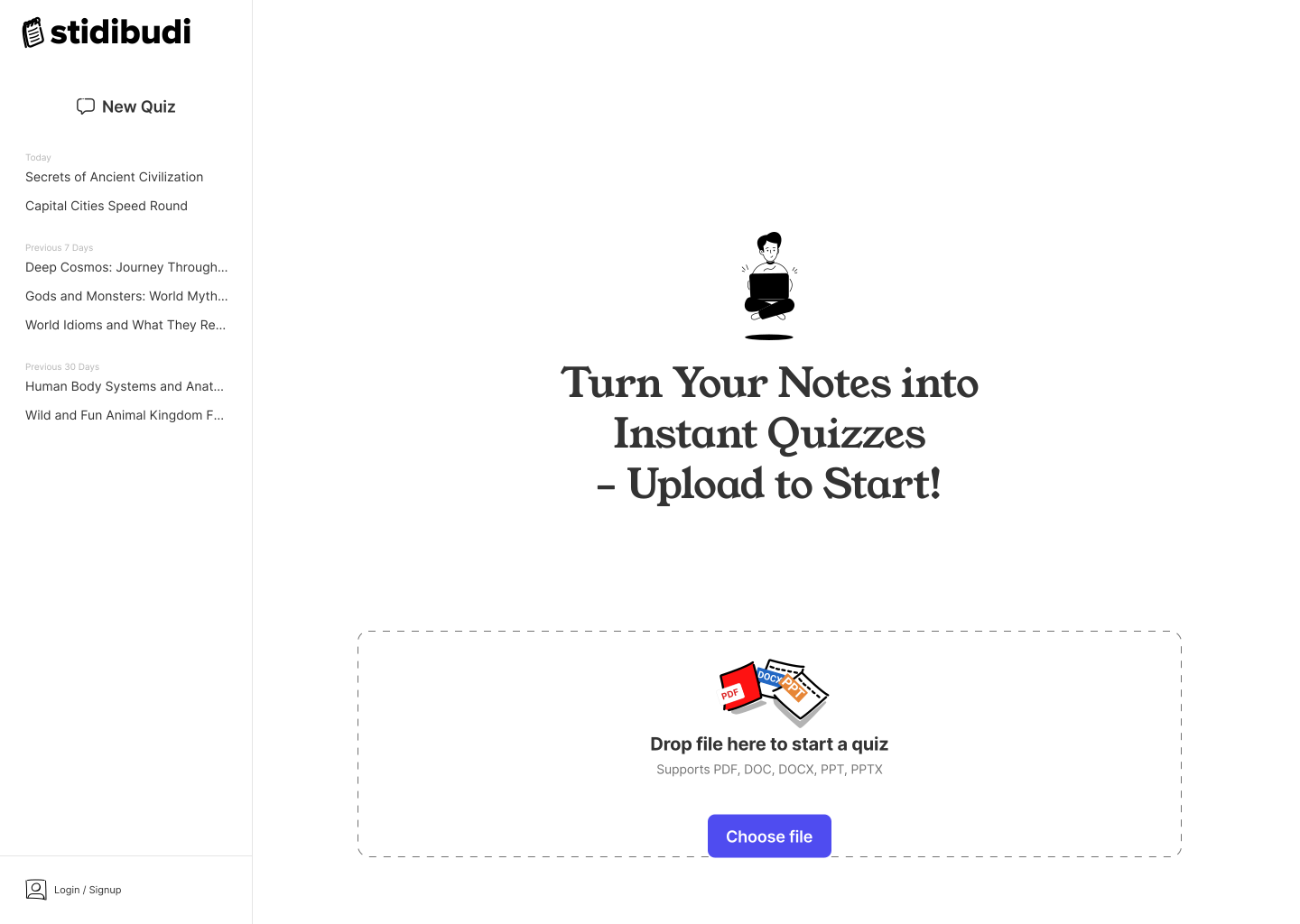
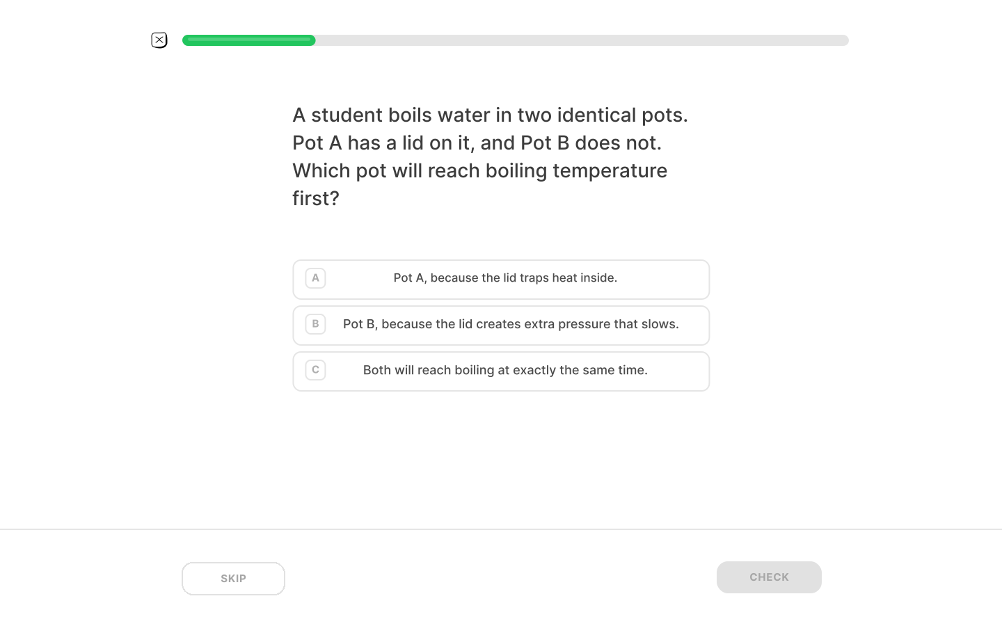
The dashboard answers "what have I been studying, what's next" at a glance. The quiz screen does the opposite job — it disappears into the background so the question is the only thing competing for attention.
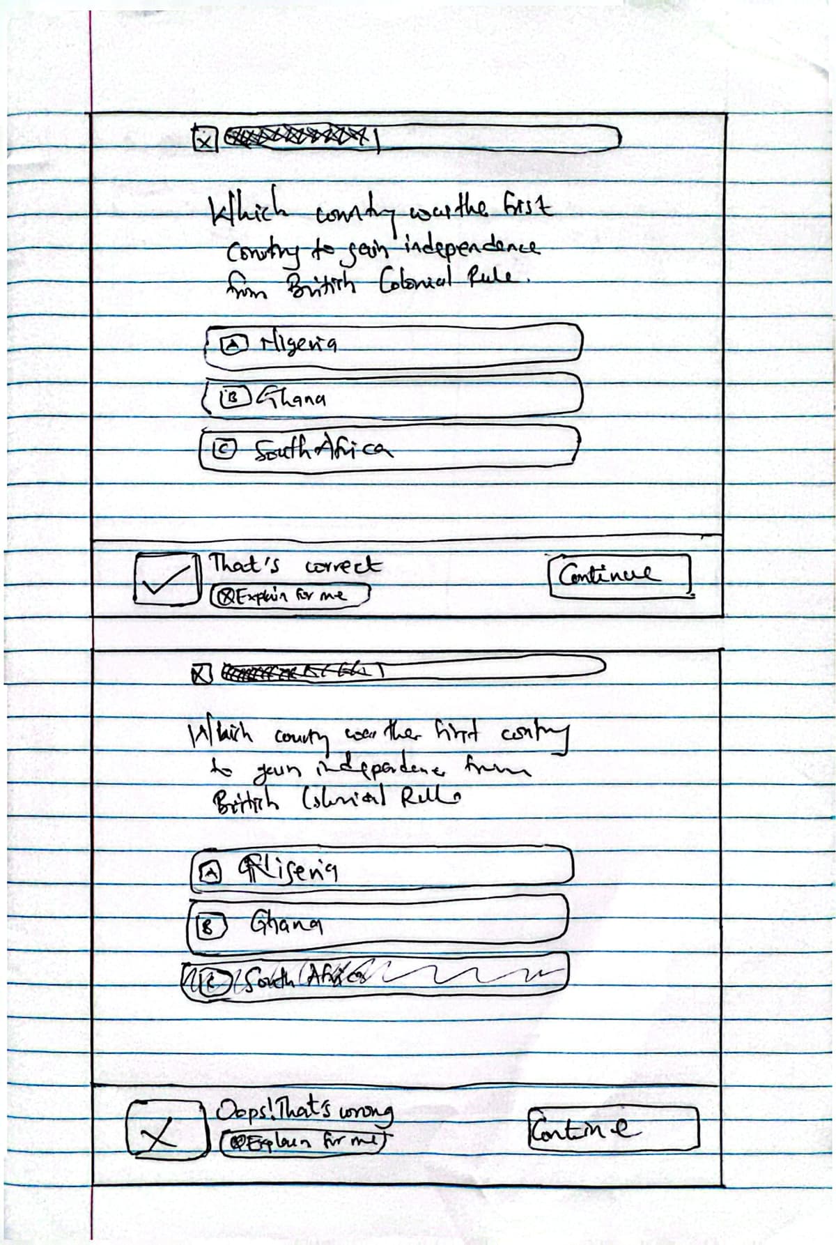
Answer feedback (correct / wrong)
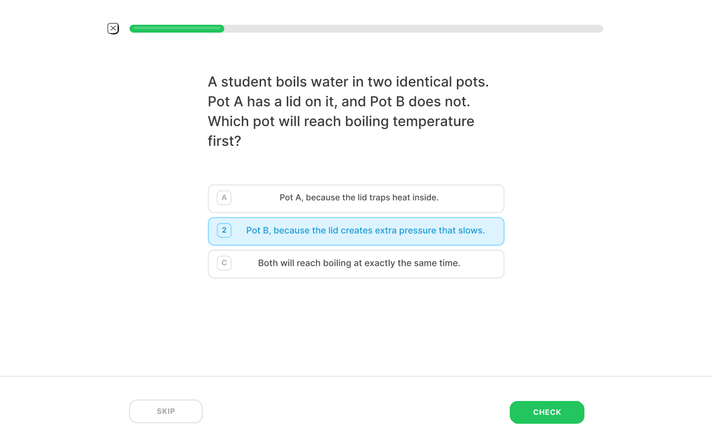
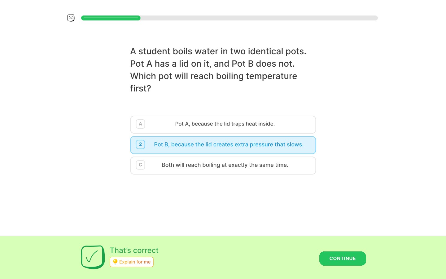
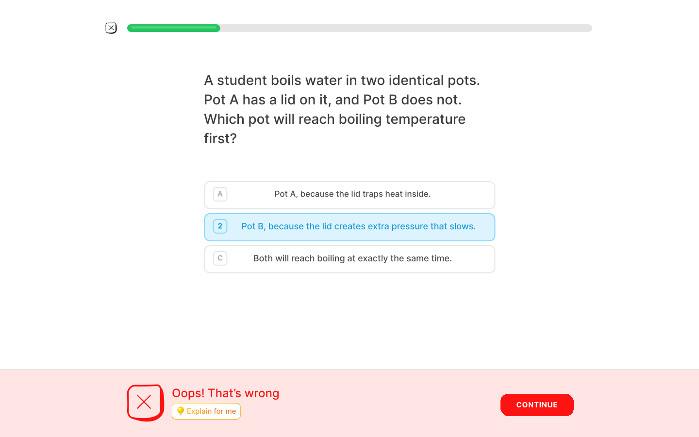
Feedback needed to be unambiguous at a glance — color, icon, and copy always agreeing — and always offer a way out of the moment ("Continue") as well as a way deeper into it("Explain for me"), so a wrong answer is a fork, not a dead end.
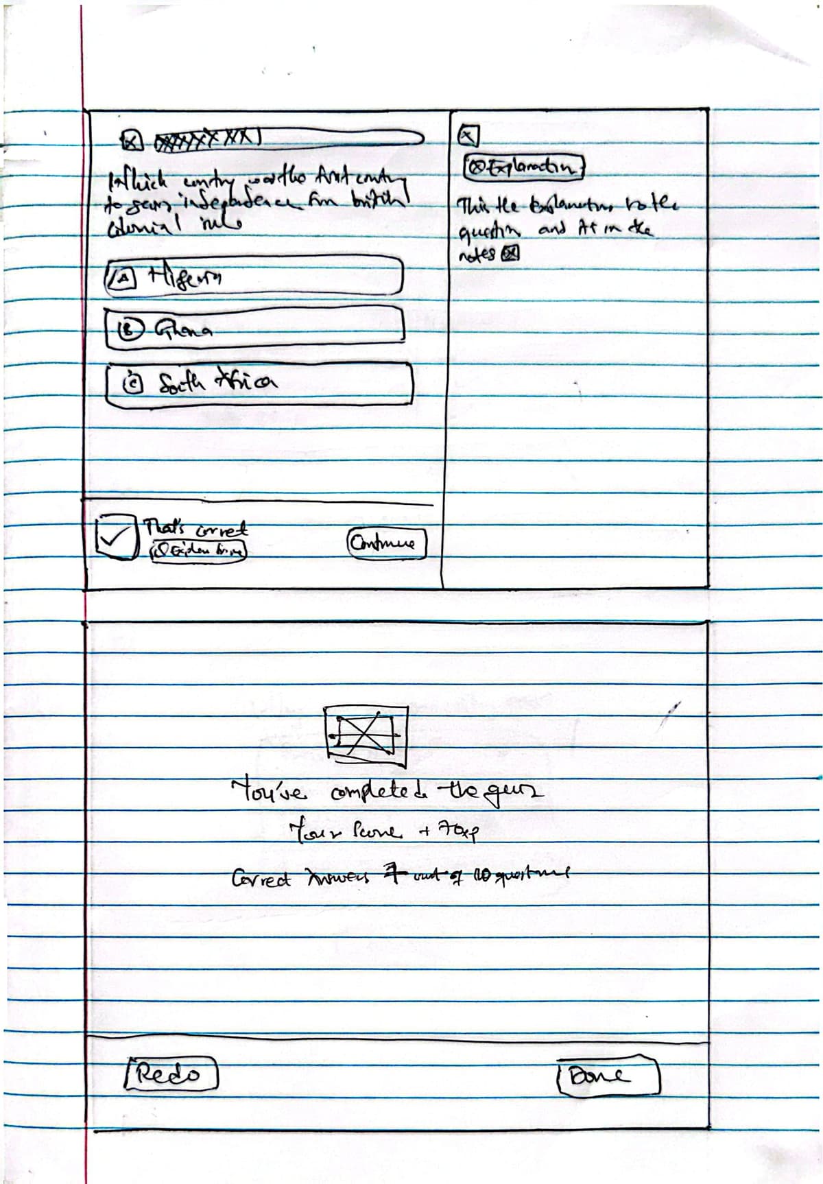
Explain-for-me and finish screen
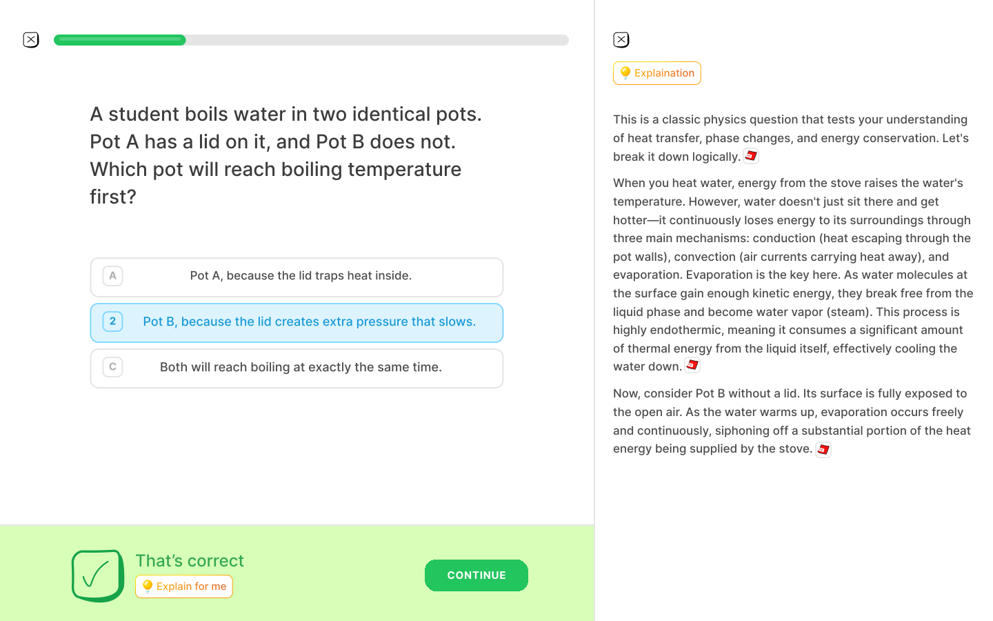
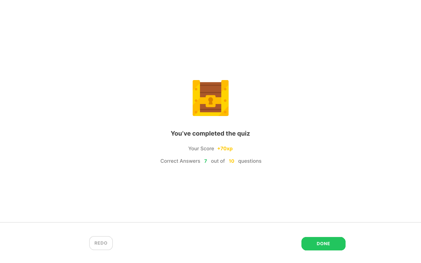
The explanation panel references the student's own notes, not a generic textbook answer, so the "why" ties back to material they actually studied. The finish screen closes the loop with a score and two clear exits: redo to reinforce, or start fresh.
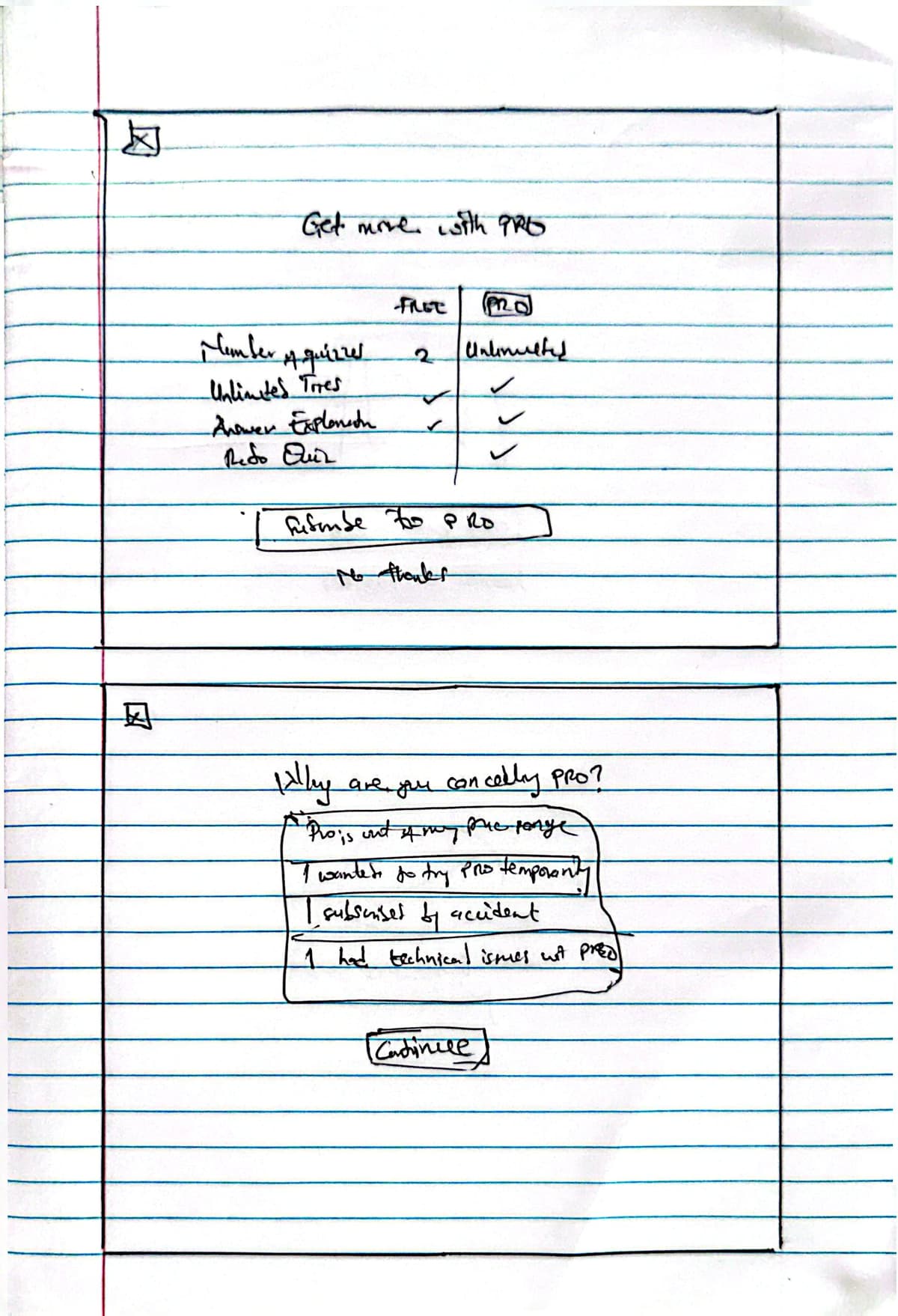
Upgrade paywall and cancellation flow
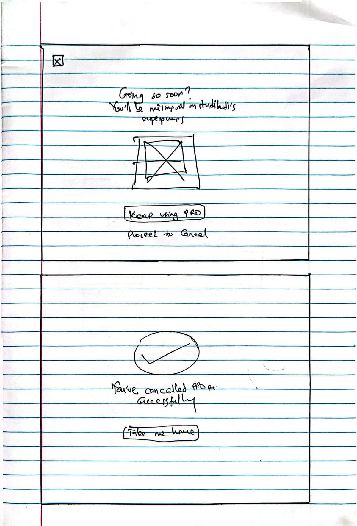
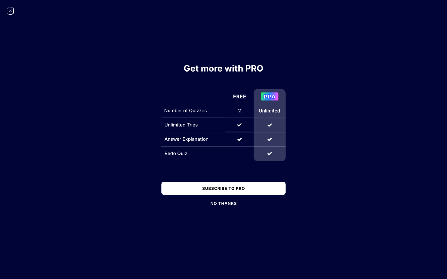
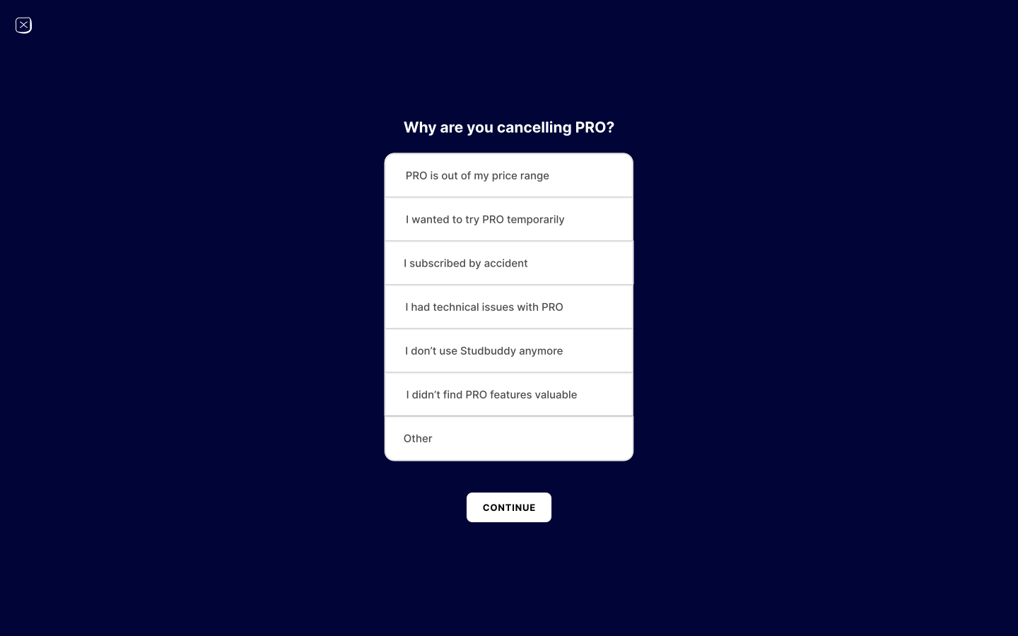
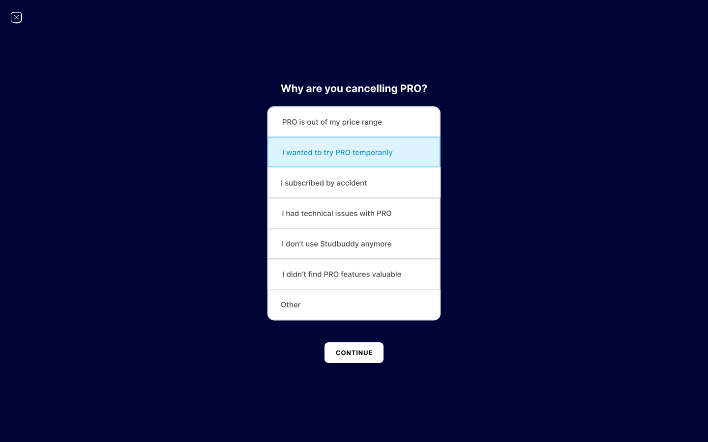
I treated the paywall and cancellation as one design problem, not two. The pricing table only features the differences that actually matter (quiz limit, redo, explanations) instead of padded rows to make PRO look inevitable. Cancellation asks why, once, without friction — a hidden button or a guilt-trip retention flow does more brand damage than a lost subscriber is worth.
2.3From wireframe to interface
Once the flow was validated on paper, I moved into high-fidelity screens with a small, consistent design system: a limited type scale, one accent color reserved for primary actions and correct/incorrect states, 8pt spacing, and reusable card/button/ input components that map directly onto the front-end library.
Landing page
Dashboard
Quiz — question, selected, correct, wrong, and explanation states
Finish quiz, subscribe, and cancellation

2.4Responsive and accessible by default, not by patch
Responsiveness and accessibility were constraints from the first wireframe, not a pass at the end:
- Responsive layout via Tailwind's mobile-first breakpoints throughout; every screen was designed and tested at mobile, tablet, and desktop widths. The quiz screen is mobile-first specifically, since most students take quizzes on their phone between classes, not at a desk.
- Accessible by construction: semantic landmarks, a logical heading hierarchy, visible focus states, sufficient contrast on text and on correct/incorrect states (never color alone — icon + label always pair with it), labeled form controls, and full keyboard operability through upload → quiz → result. Answer options and the file dropzone use proper ARIA roles.
Engineering
3.1Architecture
Stidibudi is a Next.js (App Router) + TypeScript app on Vercel, split into four layers: a Next.js frontend, an API gateway of route handlers, an AI service layer, and storage/data. The diagram below is the actual shape of the system, not a simplified stand-in for it.
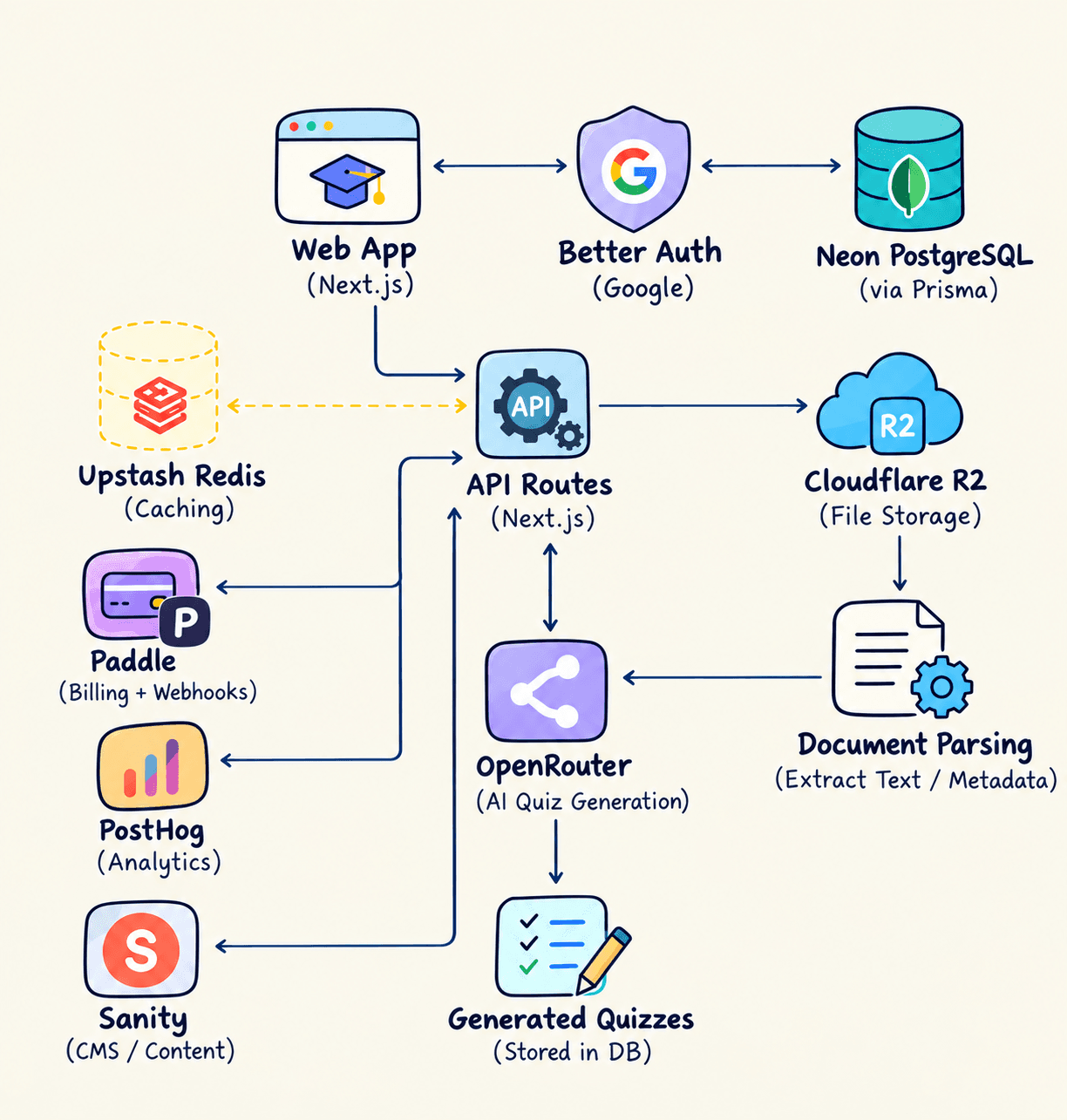
Stidibudi system architecture — frontend, API gateway, AI service, and data layers
3.1.1Request lifecycle: from file to persisted quiz
The important architectural boundary is not simply “frontend vs. backend.” It is where trust, cost, and state change hands. A user action starts in the client, crosses a server-controlled boundary for validation and orchestration, calls external AI infrastructure, and only then becomes durable application data.
Client request
User uploads study material and starts generation from the product UI.
Server boundary
Validate input, parse the file, enforce entitlement limits, and keep secrets out of the browser.
AI orchestration
Send normalized source text through OpenRouter, validate structured output, and retry malformed or failed generations.
Durable state
Persist validated quizzes and subscription state in the relational data layer; store source files separately.
This separation keeps expensive and security-sensitive operations server-controlled, makes provider failures recoverable, and prevents the UI from becoming the source of truth for business rules.
A few of those choices are worth calling out on their own:
- Next.js App Router — server components for low-interactivity views (dashboard, quiz history), client components for the interactive quiz surface, route handlers for AI generation and payment webhooks. Sensitive work — file parsing, model calls, webhook verification — stays server-side, never in the browser bundle.
- OpenRouter instead of a single model provider, so quiz generation can run against GPT-4o-mini, Claude 3.5 Sonnet, or Gemini Pro behind one interface, with automatic retry if a given model errors or times out — no single vendor outage takes the core feature down.
- Prisma + Neon Postgres for users, quizzes, questions, attempts, and subscription state, with Supabase Storage handling the actual uploaded files (PDF, DOCX, PPTX, TXT) separately from structured data.
- NextAuth.js for authentication and Paddle for billing, both wired through dedicated route handlers rather than scattered client-side logic.
- Tailwind CSS plus a small
components/library of composable primitives, and Sanity as a headless CMS for landing-page copy, so messaging can change without a code deploy.
app/ route handlers + pages (App Router)
components/ shared, composable UI primitives
context/ cross-cutting client state (quiz session, auth)
hooks/ reusable client-side logic
lib/ server-side utilities: AI orchestration, Paddle, parsing
prisma/ schema + migrations
sanity/ CMS schema for marketing content
3.2The AI generation pipeline
File in, quiz out is the core mechanic — and the part with the most failure modes, so it got the most engineering care.
1. Upload & extraction
PDF, DOC/DOCX, and PPT/PPTX are parsed server-side into clean text, stripping layout noise (headers, footers, slide numbers) before it reaches the prompt.
2. Generation via OpenRouter
Extracted text goes to a structured-output prompt returning strict JSON — stem, options, correct-answer index, and a source-grounded explanation per item. If the primary model errors or times out, the request retries against a fallback model automatically, not manually.
3. Validation before it reaches a user
Shape, duplicate-answer detection, and minimum explanation length are checked before a quiz is persisted. A malformed generation is retried, never shown — one obviously wrong question is enough to break trust in the whole product.
4. Grounded explanations
"Explain for me" is prompted with the original source text plus the specific question, so the explanation points back at the student's own notes, not a generic topic summary.
3.3Subscription and payments
Two tiers — Free (2 quizzes) and PRO (unlimited quizzes, redo, full explanations) — deliberately kept to one paid tier. The honest value gap right now is "limited vs. unlimited"; a third tier would be decoration, not strategy.
Billing runs through Paddle as merchant of record, which absorbs global sales tax/VAT compliance for an international, student-facing product — a real burden for a solo build otherwise. Subscription state syncs into Prisma via signed Paddle webhooks, which is the single source of truth the app checks before enforcing the free-tier cap.
3.4Working with AI as an engineering tool
I used Cursor as my primary editor, and it's worth being specific about how, since "I used AI" means very different things depending on the workflow behind it:
- Scaffolding, not authorship. Cursor moved fast on boilerplate — Prisma models from a schema I sketched, Tailwind component variants, route handler skeletons — but architecture decisions (App Router, where AI calls live, how the free/PRO gate is enforced, webhook verification) were mine, made before I wrote a prompt.
- Reviewed, not merged blind. Anything touching money or security — webhook verification, quiz-limit enforcement, upload validation — was read and manually tested before shipping. AI code is a fast first draft, not a finished one.
- A second reviewer, not just an author. I used it as a rubber duck for edge cases — "what if this PDF has no extractable text," "what if the Paddle webhook arrives twice" — which shaped defensive checks (idempotent webhook handling, an empty-state for unparseable uploads) before they became production incidents.
- Where it didn't help: the wireframes and the UX judgment calls — cancellation copy, the wrong-answer state — were entirely manual. Strong pair for code, poor substitute for product judgment.
3.5Code quality and conventions
- ESLint on every commit, strict TypeScript (
strict: true) soanyis a reviewed decision, not a default. - Component boundaries by responsibility: presentational components stay pure and prop-driven; fetching and mutation live in hooks or server components, not scattered inside JSX.
- Composable primitives over one-off screens — the same
Button,Card, andModalappear on the dashboard, quiz screen, and paywall, keeping design and code in sync as the product grows. - Environment-gated config for OpenRouter, Supabase, and Paddle keys, never committed, with typed
process.envaccess so a missing variable fails loudly at build time.
3.6Reliability, security, and failure boundaries
- Server-side trust boundaries: AI calls, file parsing, payment webhook verification, and entitlement enforcement stay off the client so users cannot legitimately bypass the product's core business rules.
- Validate before persistence: generated quiz data is checked before it becomes durable state. This turns model output from an assumption into an explicitly validated application contract.
- Provider failure is expected: model errors, timeouts, malformed output, and unparseable uploads are treated as normal failure modes with fallback, retry, or a user-facing empty/error state rather than as exceptional paths.
- Billing is webhook-driven: subscription state comes from signed Paddle events and is persisted before the entitlement check, rather than trusting a client-side “paid” flag.
- Secrets stay server-side: provider keys are environment-managed and never embedded in the client bundle or committed to source control.
3.7Deployment
Deployed on Vercel: edge-cached marketing pages, serverless functions for AI generation and payment routes, and a preview deployment on every branch so a change is reviewable in a real, running environment before it reaches main.
Outcomes
Stidibudi moved from an idea into a live product with measurable usage and paying customers. PostHog gave me a view into how people actually used the product after launch, while product-level metrics showed that the core quiz-generation loop was being used repeatedly rather than functioning as a one-off demo.
Usage
2K+
quizzes generated every month
Engagement
4m 37s
average session duration
Reach
1,876
unique visitors in the measured 7-day period
Revenue
12+
paying users
4.1What the product usage showed
I instrumented the product with PostHogto understand whether people were actually reaching the product, how often they returned, and how long they stayed. The measured period shows 1,876 unique visitors, 3,542 page views, 2,312 sessions, a 4m 37s average session duration, and a 28% bounce rate. At the time of the snapshot, 7 users were recently online.
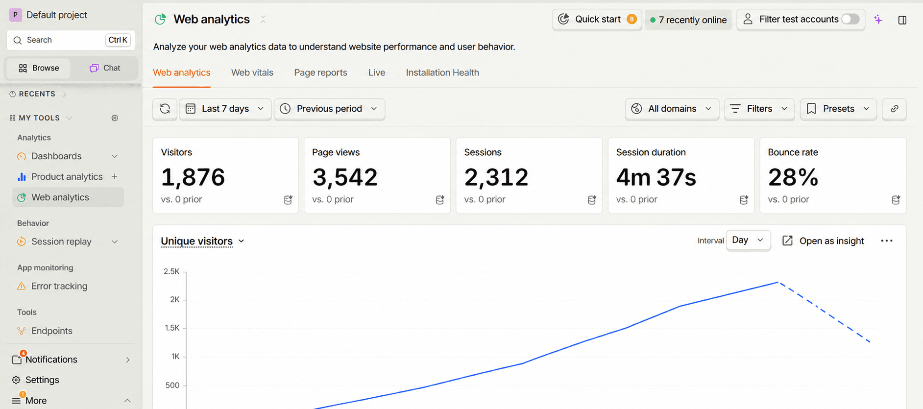
PostHog product analytics — traffic, sessions, engagement, and live usage
- 1,876 unique visitors were recorded across the seven-day window shown in PostHog, giving the product a meaningful amount of real-world usage beyond a portfolio prototype.
- 2,312 sessions and 3,542 page views showed continued interaction with the product rather than traffic stopping at the landing page.
- 4m 37s average session duration indicated longer stays per session, supporting the decision to make the quiz experience focused enough for students to continue through the learning loop.
- 28% bounce rate provided a useful signal that the majority of visitors were not immediately leaving after their first page view.
- The product reached 2K+ generated quizzes per month, making quiz generation the clearest recurring usage signal for the core product value proposition.
- The product converted usage into 12+ paying users, validating that the free-to-PRO boundary was supporting a real monetization path rather than existing only as a theoretical SaaS feature.
4.2What I owned end-to-end
- Built the complete product experience from the initial concept through production, rather than stopping at a prototype.
- Designed the UX and UI in Figma and translated the design into the responsive product experience.
- Connected the learning workflow, file processing, AI generation, persistence, authentication, analytics, and billing into one product system.
- Established clear boundaries between the client experience, server-side processing, AI orchestration, application state, payment state, and product analytics.
- Product definition and the core upload → quiz → feedback → redo experience.
- UX and UI design in Figma, including responsive states and reusable interface patterns.
- Frontend architecture and implementation with Next.js, TypeScript, and reusable components.
- Server-side file processing, AI integration, validation, and persistence.
- Authentication, subscription flows, and payment integration.
- Product analytics and usage instrumentation with PostHog.
- Production deployment and iteration based on real product usage.
Challenges and Trade-offs
Generation latency vs. perceived speed
A large PDF takes real time to parse and generate ten good questions from. Staged feedback (uploading → reading your file → building your quiz) shrinks how long the wait feels, at the same actual wait time.
One paid tier vs. the temptation to add more
A "Team" or "Student Plus" tier would have looked more like a mature SaaS company. I held the line at one, because the product doesn't yet have distinct enough value at a third price point.
Provider dependency
A product whose core feature is an LLM call can't depend on a single vendor. Routing through OpenRouter with automatic model fallback cost extra setup time up front for a product that doesn't go dark on a single outage.
What I'd Do Next
- A lightweight difficulty control ("make this harder/easier") in the upload flow, instead of one fixed difficulty.
- Spaced-repetition scheduling on top of redo, so "redo this quiz" becomes "redo what you got wrong, on the day you're most likely to forget it."
- More automated test coverage specifically around the AI validation layer, since that's the surface most exposed to provider-side change.
Stidibudi is a small product with a simple promise: upload your notes, get a quiz that's actually about your notes. The interesting work was never any single screen — it was taking an idea from product strategy and Figma into a production system, then making the system resilient enough to support real users, real payments, and measurable product usage.
The result was a product generating 2K+ quizzes every month, supporting 12+ paying users, and recording a 4m 37s average session duration in PostHog. I designed and built the experience end-to-end, from the interaction model and component system to the AI pipeline, analytics, data boundaries, entitlement logic, and deployment architecture.
The Product is live at stidibudi.com