
Designing the Command Center: A Restaurant Operations Dashboard
A UX case study on designing a dashboard that gives restaurant owners and managers an instant, trustworthy read on business health
Role
Product Designer
Scope
UX strategy, information architecture, dashboard design, data visualization, and interaction design
Platform
Web
Focus
Restaurant operations, reporting, and data-heavy workflows
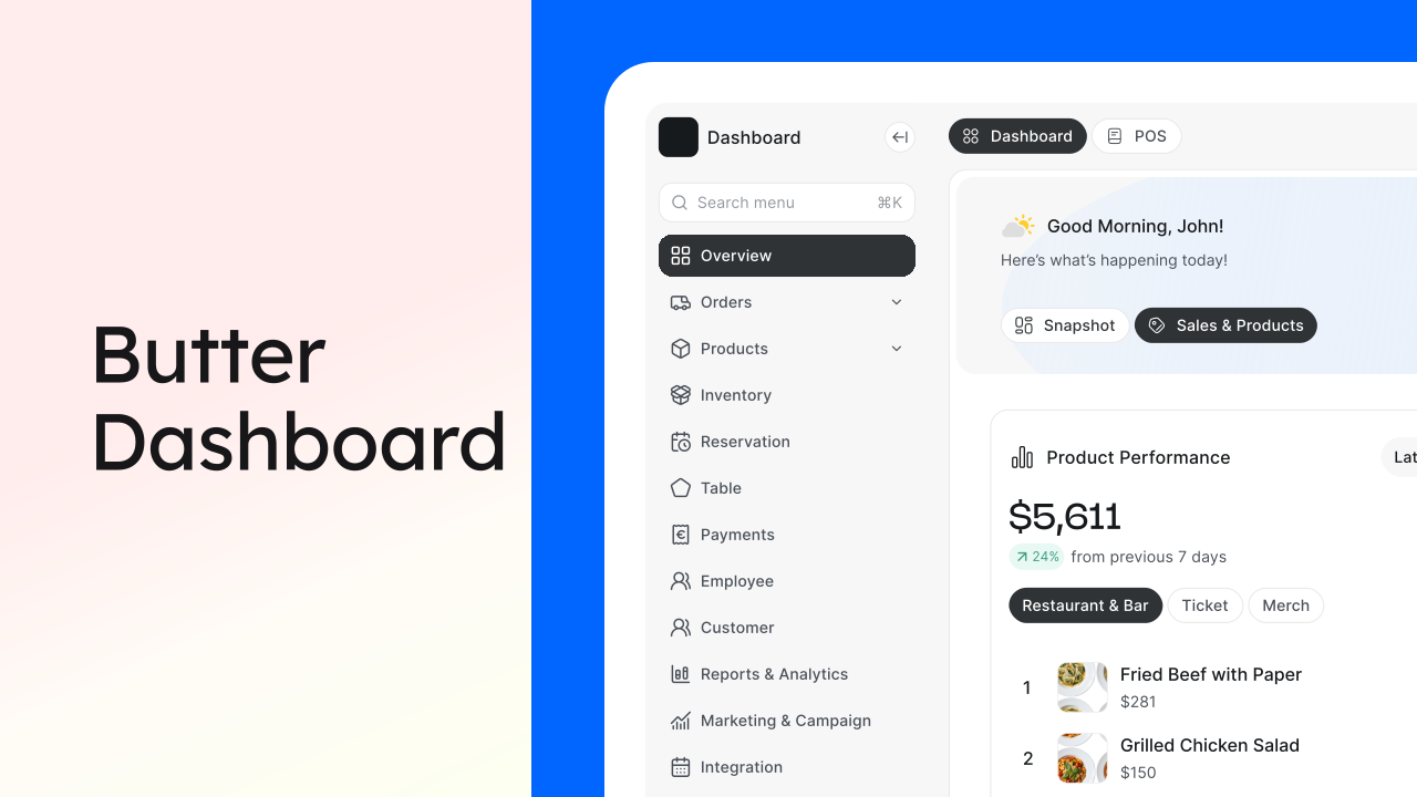
I designed the Dashboard for a new restaurant operations platform being built from the ground up. The challenge was to make the first screen useful at a glance without turning it into a wall of metrics.
The solution was built around two jobs: check the pulse and dig into sales and products. That became the foundation for the Snapshot and Sales & Products tabs.
What I did
- Competitive teardown of 6 adjacent products to understand familiar dashboard patterns and gaps.
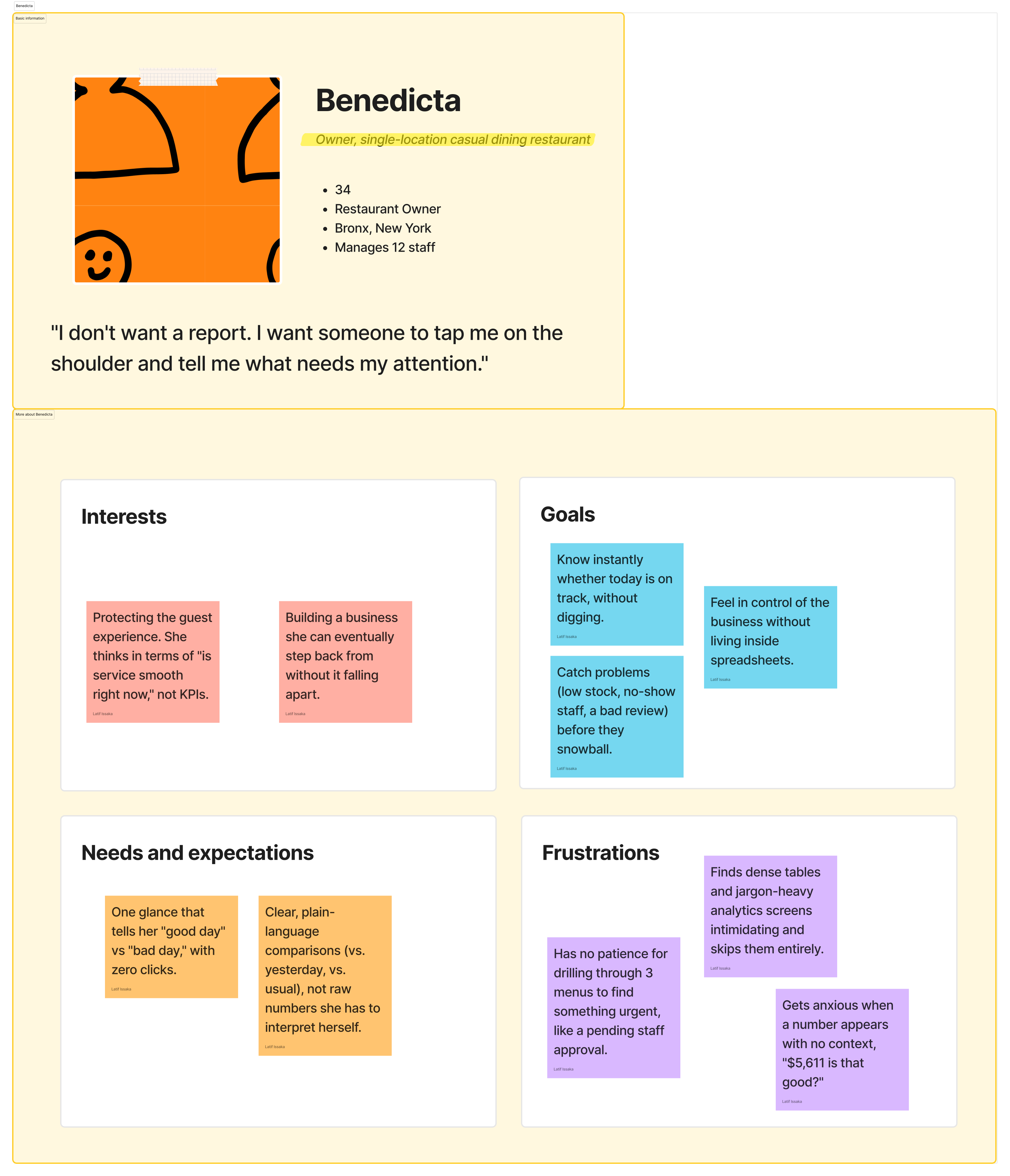
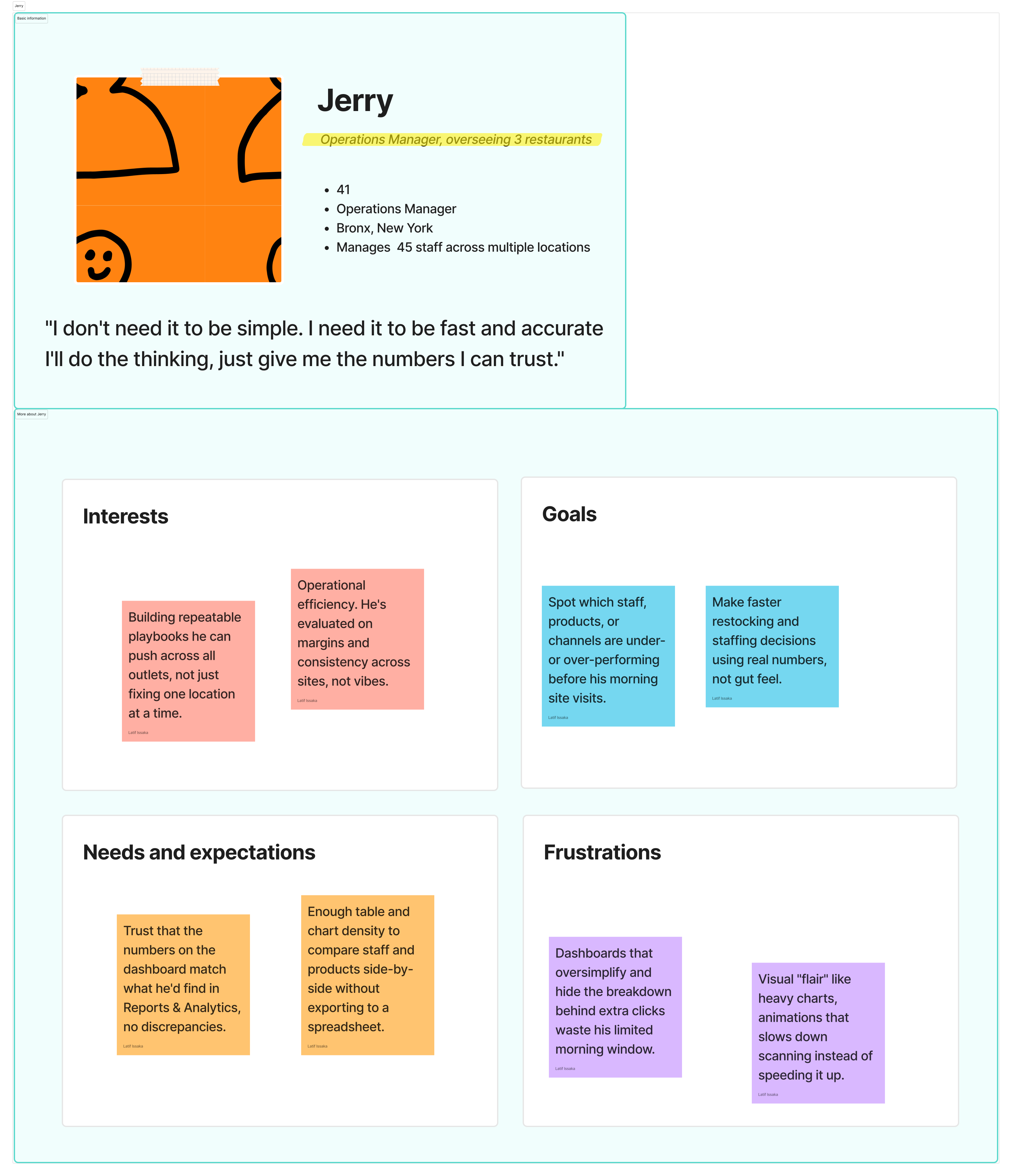
- Defined two working personas to represent owner operators and multi outlet managers.
- Mapped the information architecture and tested the structure through grayscale wireframes.
- Designed the Snapshot and Sales & Products experiences around different information needs.
- Tested the high fidelity prototype with 5 participants and iterated on the dashboard structure and content.
The Problem
Context: This was a 0 to 1 restaurant operations platform bringing orders, POS, inventory, staff, reservations, tables, payments, customers, and marketing into one system.
The ask: Create the starting point for owners and managers, giving them a quick and trustworthy view of business health without overwhelming them.
Different Operating Needs
Single location owners and multi outlet managers need different views of the same business.
Time Sensitive Information
Sales, inventory, and staffing can change throughout the day.
Product Orientation
As the entry point to a larger platform, the dashboard also needed to help users understand where to go next.
My Role
I was the sole product designer for the Dashboard, taking it from early product thinking through final UI and developer handoff. I worked across discovery, information architecture, UX, visual design, testing, and the design system supporting the experience.
Project Scope
The work covered the Dashboard from early discovery through final interface design and validation.
Discovery
Product conversations, competitive analysis, card sorting, and contextual walkthroughs.
Structure
Information architecture, user flows, page structure, and responsive layout decisions.
Visual Design
Two dashboard tabs, reusable data cards, responsive states, and the visual language shared with the wider product.
Research & Discovery
4.1Research Approach
Because the product was being created from scratch, the research was not about improving an existing dashboard. I focused on understanding the restaurant operations space, studying familiar product patterns, and deciding what the first screen actually needed to communicate.
The main question was simple: what does someone need to understand first, and how can we show it without creating noise?
| Track | Method | Purpose | Sample |
|---|---|---|---|
| Product Discovery | Product goals and restaurant workflow conversations | Define the dashboard's role | Product and business stakeholders |
| Competitive Teardown | Analysis of 6 adjacent products | Understand familiar patterns and information density | Toast, Square, Lightspeed, Petpooja, Notion, Linear |
| Card Sorting | Remote sorting exercise | Prioritize candidate metrics | 9 restaurant owners and shift managers |
| Contextual Walkthroughs | Observation and narration | Understand real operating routines | 2 small business owners |
4.2Key Research Findings
| Finding | Design Implication |
|---|---|
| Owners check dashboards in short bursts. | Prioritize scannability and self explanatory metrics. |
| Comparing performance matters more than seeing an isolated number. | Core metrics need a clear comparison. |
| Multi outlet businesses need to filter their view. | Relevant cards need their own segment controls. |
| People and operations matter alongside revenue. | Staff and operational signals belong on the dashboard too. |
| Users had two clear jobs: check the pulse or dig deeper. | Separate those jobs into two focused tabs. |
Personas
I used two lightweight working personas to keep the dashboard grounded in different operating needs.
Information Architecture
The planned product covered 12 modules across operations, sales, inventory, staff, customers, payments, marketing, and reporting. The Dashboard sits above them as the Overview, bringing important signals together without duplicating the functionality of each module.
Each card was tied back to a clear source of truth in the wider product.
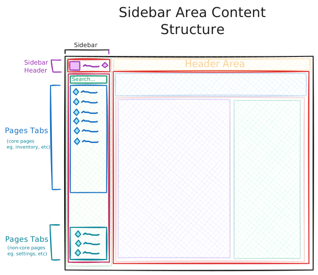
The dashboard sits at the top of the product hierarchy, summarizing signals from the wider platform.
6.1Page Level Structure
Four structural layers were used across both tabs.
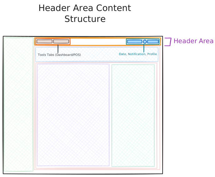
Global Header
Workspace switcher, module navigation, date and time, notifications, and account controls.
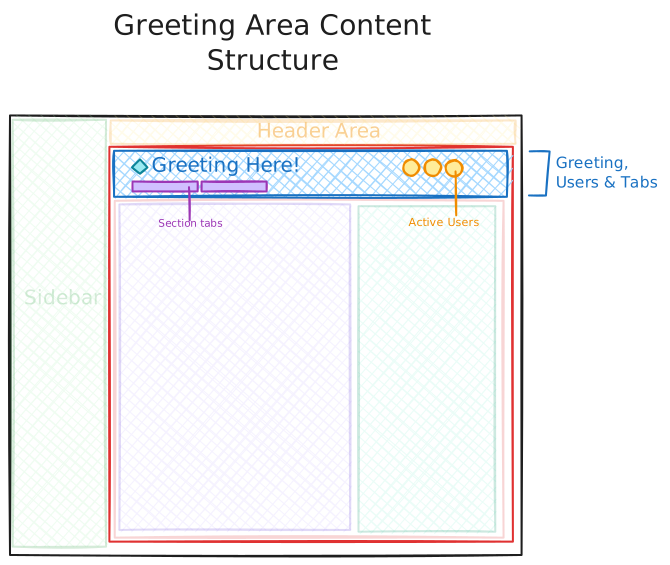
Greeting + Context Strip
Personalized greeting, team context, and the Snapshot / Sales & Products tab switcher.
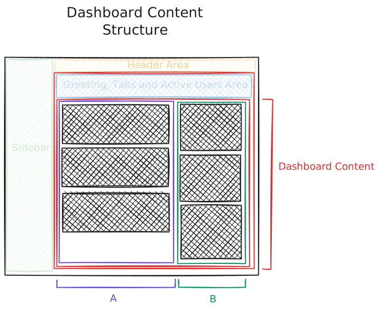
Primary + Secondary Content
The primary column carries the main business story. The secondary column provides supporting context such as Music, Device IoT, Reminders, Sales by Channel, or Payment.
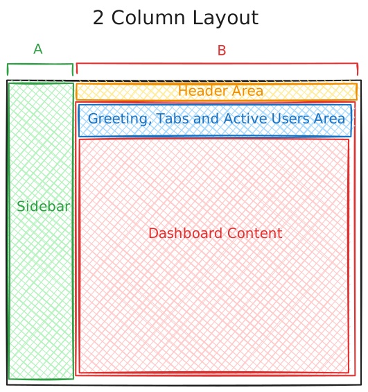
Dashboard Layout Grid
A 12 column responsive grid with a 24px gutter and a 7/5 content split.
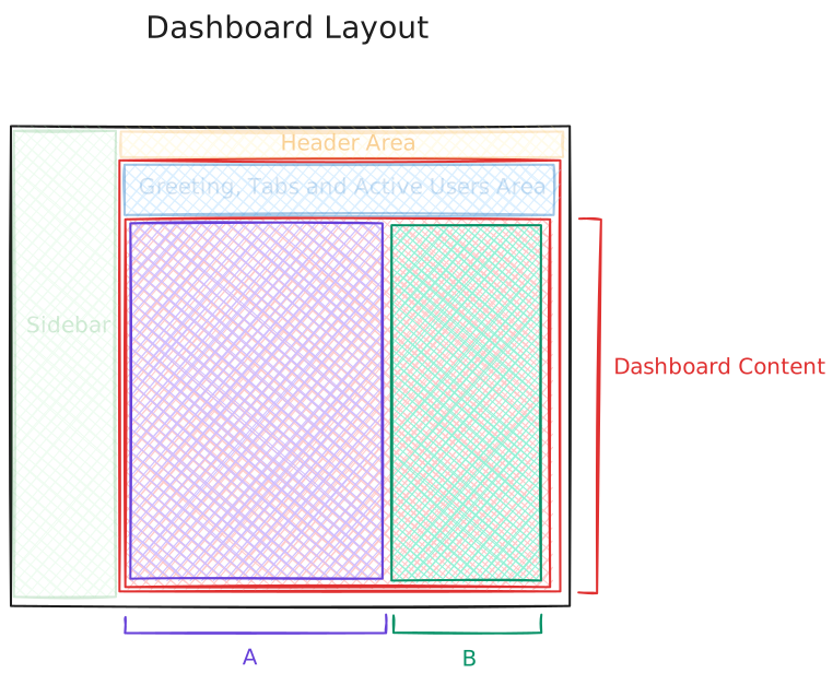
Why 65/35
A 50/50 split gave the secondary rail too much visual weight. The 65/35 balance keeps the main business story dominant while leaving enough room for useful context.
Wireframes
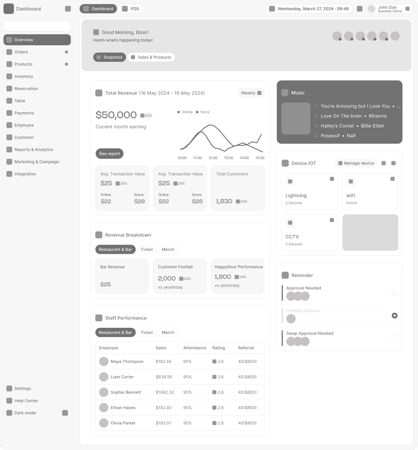
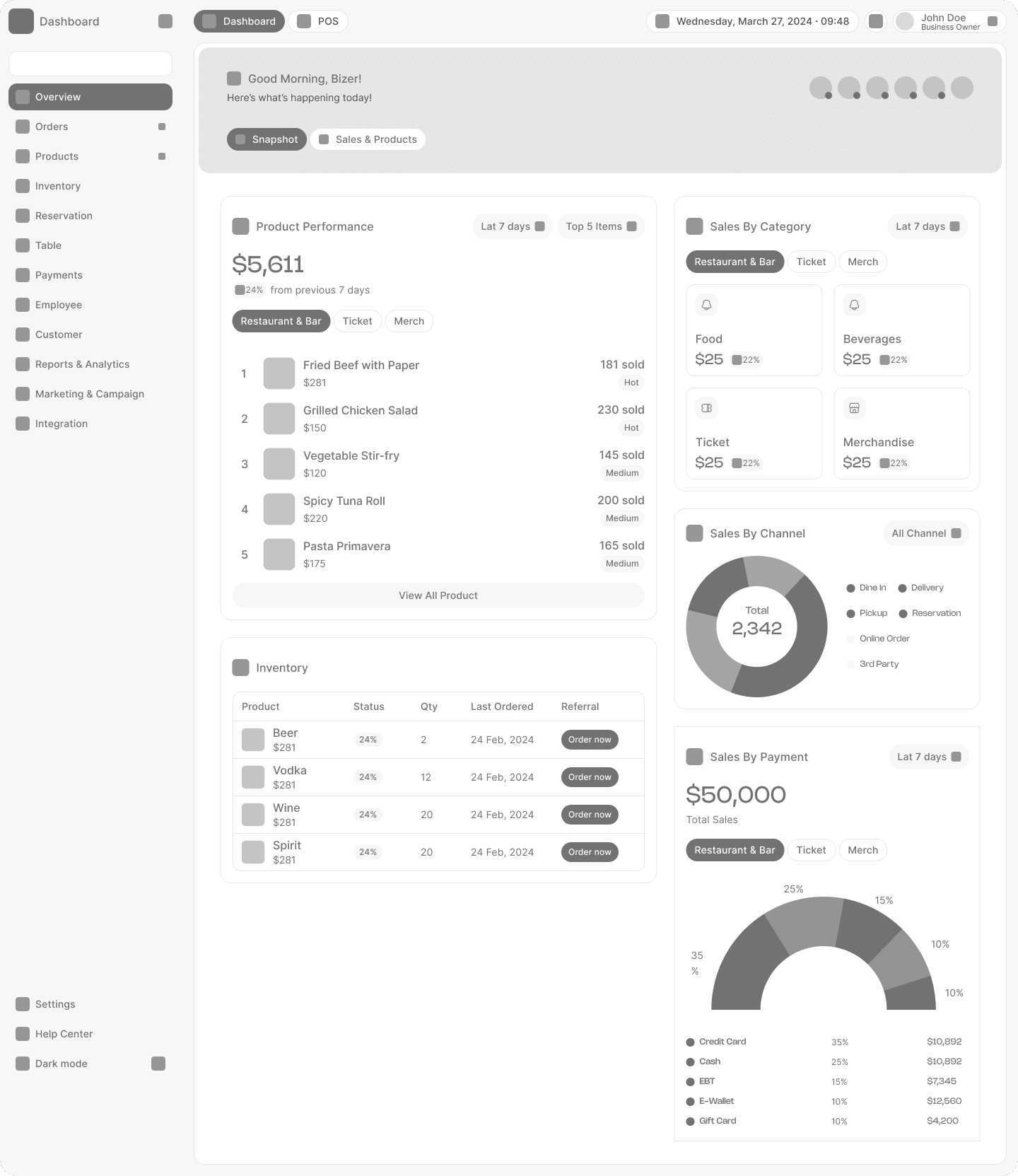
I used grayscale wireframes to test structure and hierarchy before introducing visual styling. With this much information on screen, the layout needed to work before the UI looked polished.
7.1What the Wireframes Tested
- Chunking: Could each card communicate its own metric, comparison, and supporting information?
- Reading order: Did the visual flow match the intended priority?
- Tab logic: Did the separation between Snapshot and Sales & Products make sense?
7.2What Changed After Review
- Inventory: Reduced from 8 columns to 5 and added an Order now action.
- Reminders: Added approval and staff swap states after they emerged as important operational tasks.
- Product and inventory cards: Stacked vertically so product performance could lead naturally into inventory decisions.
Key Design Decisions
The reasoning behind the final experience.
8.1 Two tabs instead of one long page
Snapshot supports quick checks while Sales & Products supports deeper analysis. Separating the jobs kept both experiences focused.
8.2 Standardized card anatomy
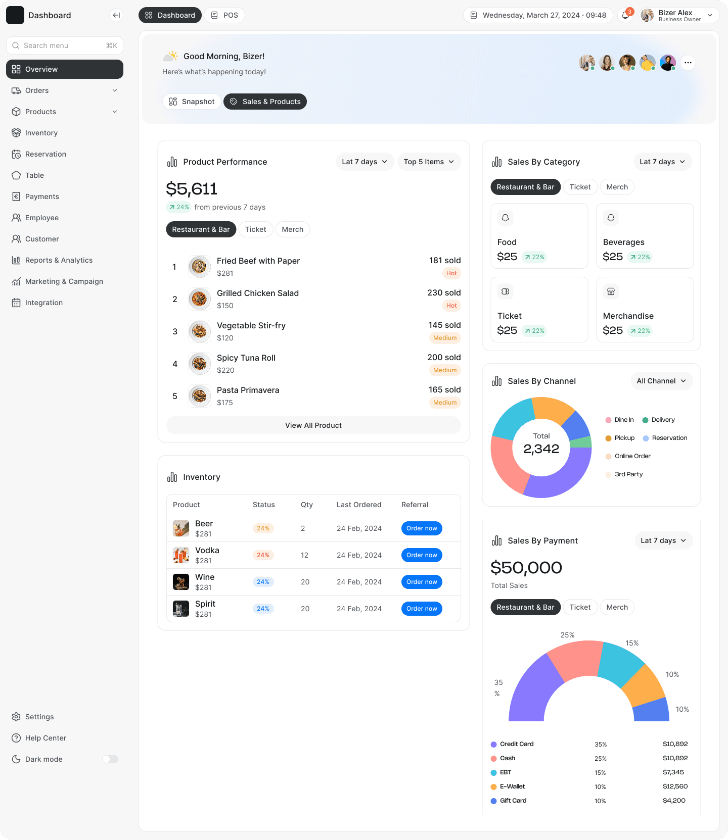
Cards follow a consistent pattern of icon, title, primary metric, comparison, visualization, and optional action. Users learn the pattern once and reuse it throughout the dashboard.
8.3 Segmented filters
Relevant cards own their segment filters, allowing users to compare different parts of the business without changing the entire dashboard.
8.4 Hierarchy through scale and weight
Type scale, spacing, and elevation carry most of the hierarchy. Color is reserved mainly for actions, status, and positive or negative changes.
8.5 Glanceable trust over theatrics
Charts were chosen for readability rather than visual novelty. Trends use lines, proportions use donuts, and ranked performance uses lists.
8.6 Contextual right rail
The secondary column changes with the user's task. Snapshot focuses on environment and people, while Sales & Products focuses on financial context.
Visual Design System
The Dashboard was designed alongside the product's foundational design system, which I created from scratch. It provided the visual language, spacing, components, and interaction patterns used throughout the experience. See the design system case study.
- Grid: 12 column responsive grid with 24px gutters and a 7/5 content split.
- Type: Restrained scale with clear hierarchy between metrics, card titles, body content, and supporting information.
- Color: Neutral surfaces with brand accents and a controlled semantic color system for status and changes.
- Components: Shared cards, filters, comparison chips, avatar stacks, tables, and other reusable primitives.
Final Screens
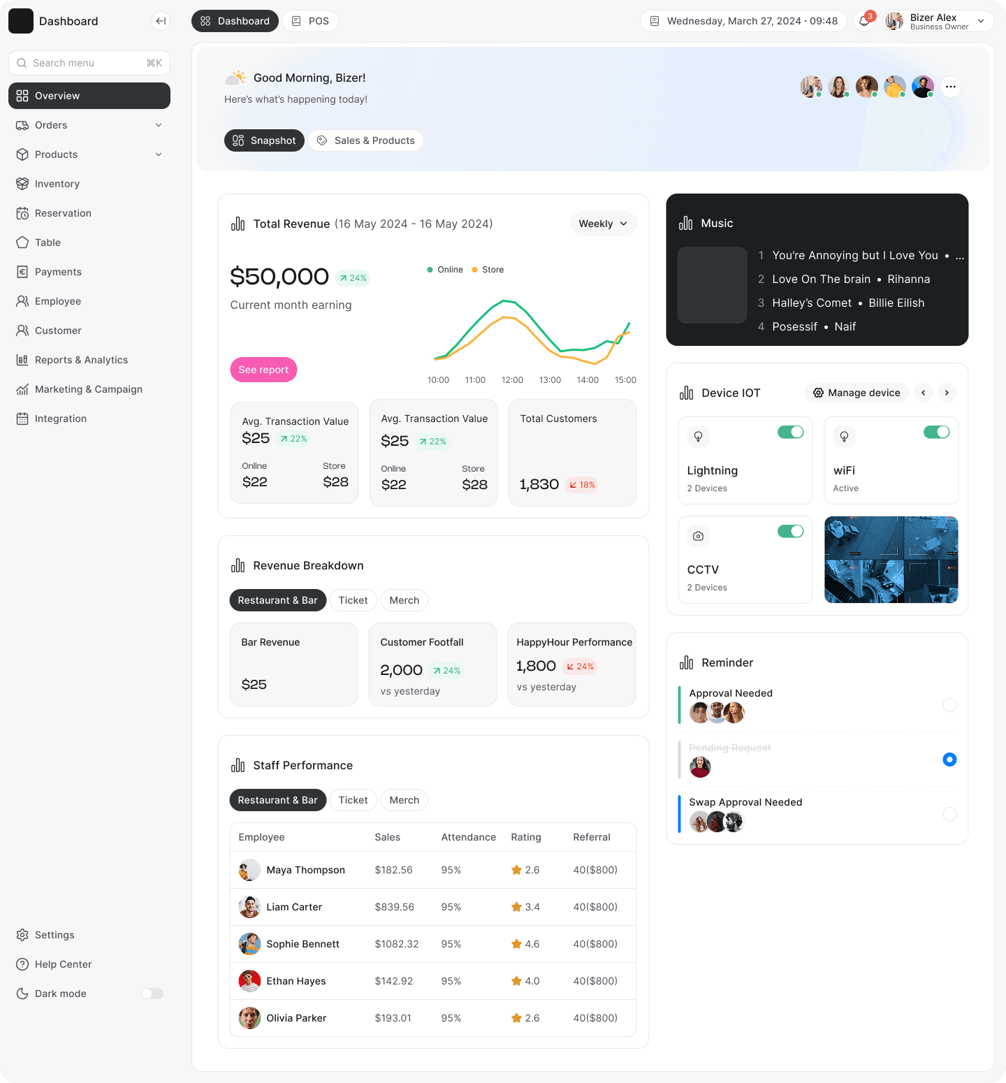
Snapshot: Pulse Check
The default landing view. Revenue, revenue breakdown, and staff performance form the primary story, with operational context in the right rail.
Sales & Products: Deep Dive
Product performance and inventory lead the primary column, supported by sales category, channel, and payment breakdowns.
Validation
I reviewed the high fidelity prototype with 5 participants across three representative tasks.
- Tell me if today is better or worse than usual.
- Find out if you're running low on stock.
- Approve a pending staff swap request.
| Task | Success | Avg. time |
|---|---|---|
| Read today's performance | 5/5 | ~8 seconds |
| Spot low inventory | 4/5 | ~14 seconds |
| Approve staff swap | 5/5 | ~6 seconds |
Outcomes
- 100% task success on the primary pulse check, with participants reading the day's performance in under 10 seconds.
- Two tab structure validated through testing, with users understanding the different purpose of each view.
- Reusable card patterns established so new dashboard content could follow the same structure.
Reflection
What worked
Designing around mental models rather than simply grouping data made the dashboard easier to understand. Establishing the card pattern early also made later iterations much faster.
What I'd do differently
I would add stronger quantitative validation once the product had real usage data. Interaction rates, filter usage, and card engagement would help validate decisions beyond the qualitative sessions.
What I'd explore next
A configurable dashboard could eventually let power users pin or reorder cards. The card based structure leaves room for that without changing the foundation.
The main lesson was simple: restaurant operators check the dashboard in short bursts, so scannability has to win over density.
Thanks for reading. If you'd like to see the prototype or talk through the decisions behind the dashboard, I'd be happy to walk through it.
Thanks for reading.